How an industrial SaaS UX redesign reduced task completion time by 65%
About the project
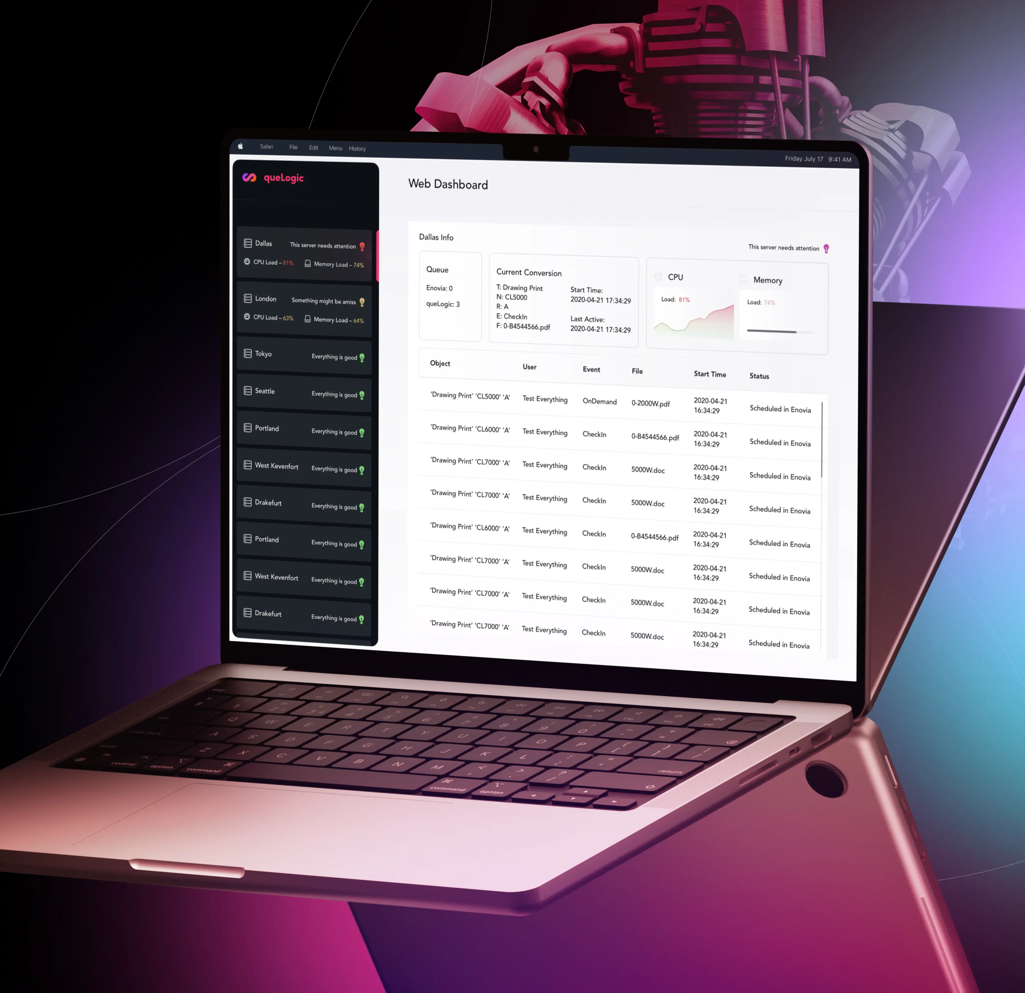
Qore8 partnered with Lazarev.agency to redesign its enterprise workflow optimization platform, removing critical workflow bottlenecks and improving operational clarity. The objective of the industrial SaaS UX redesign was to increase productivity, reduce task completion time, and improve user adoption across engineering and project management teams.
Through a structured workflow optimization strategy and user-centered platform redesign, we streamlined complex processes, improved usability, and strengthened adoption across core engineering workflows.
65%
reduction in document conversion workflow time
3x
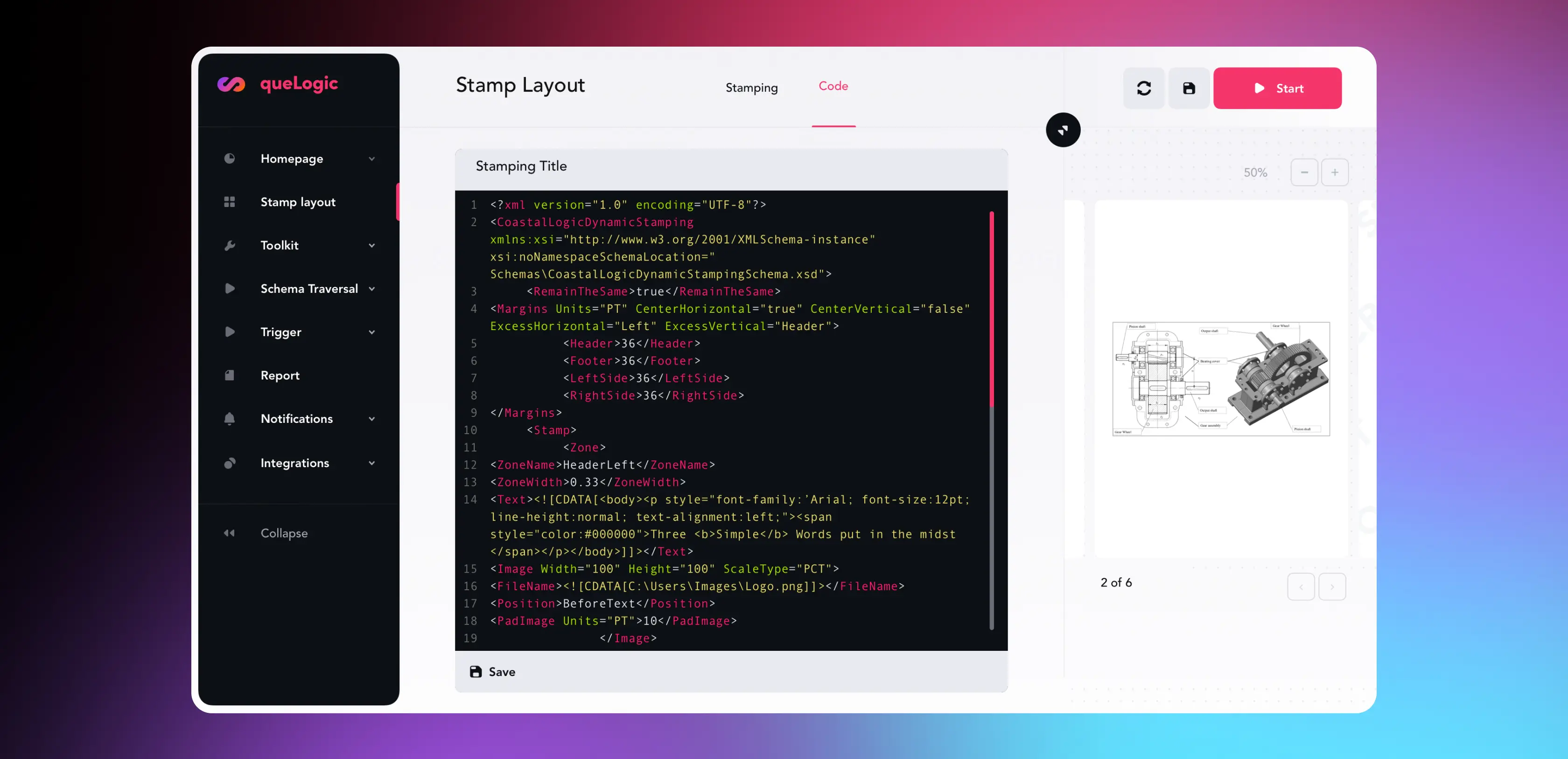
faster stamp layout creation
Introduced a scalable design system for enterprise consistency
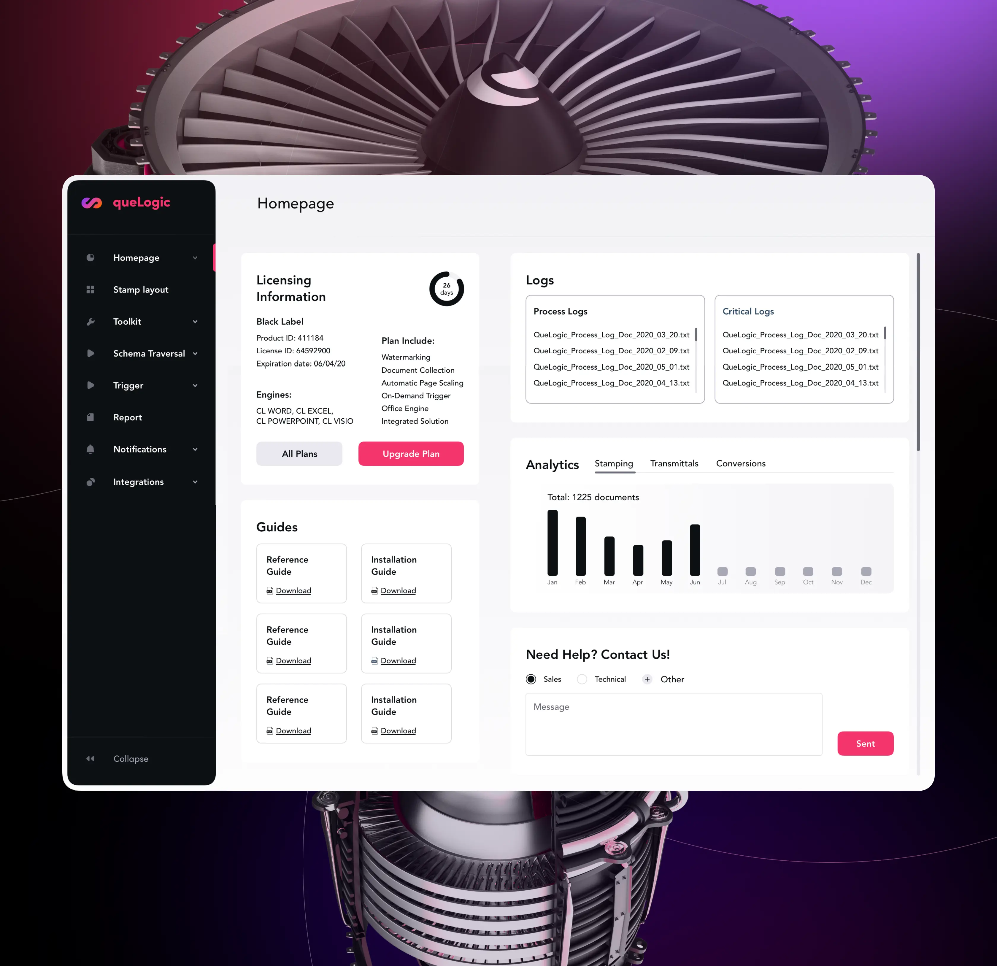
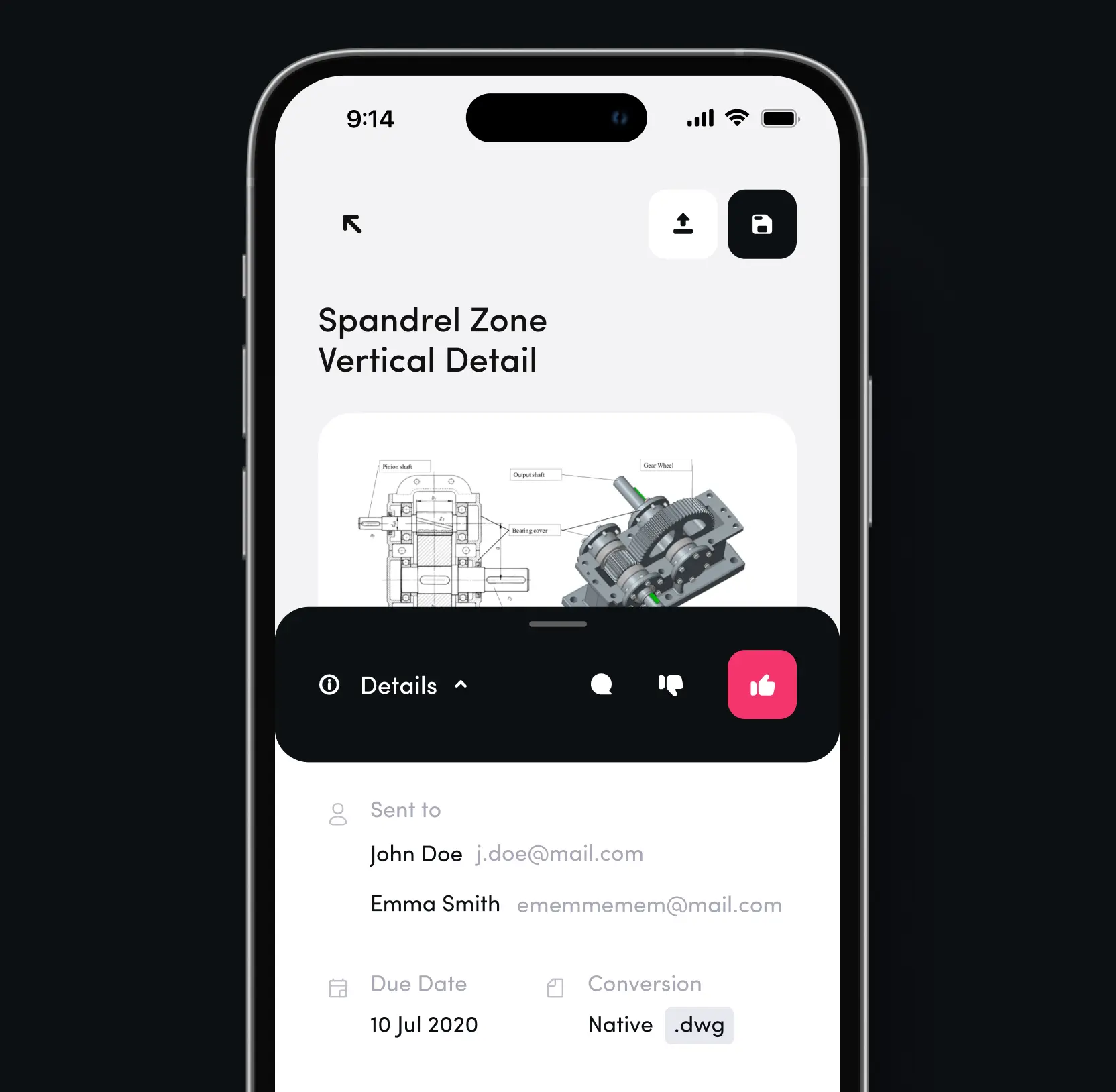
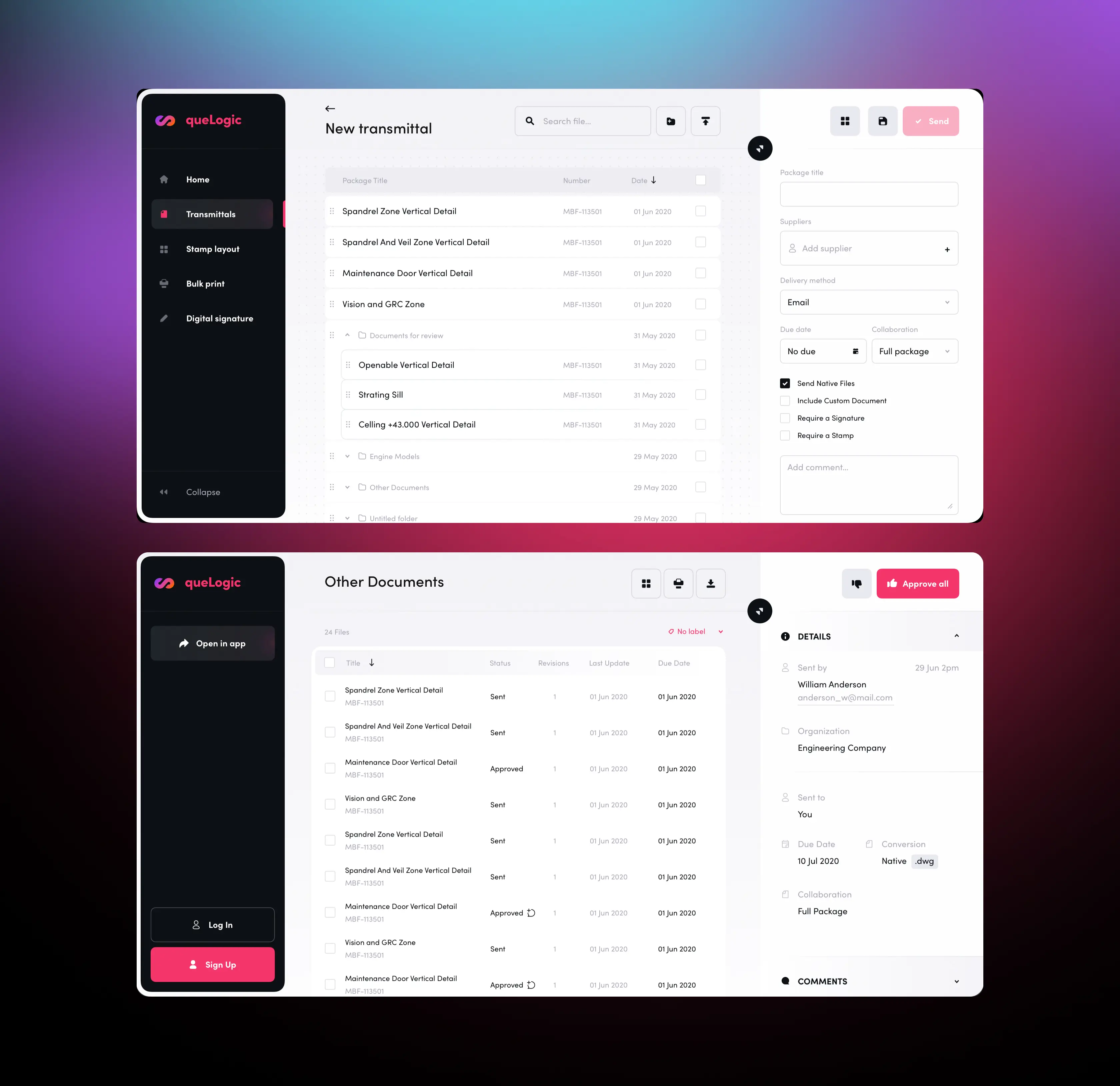
Through an industrial SaaS UX redesign, we transformed Qore8’s outdated interface into a modern, performance-driven workspace. The previous interface overwhelmed users with complex navigation that hindered critical asset management tasks. Our redesign introduced intuitive user flows, role-based interfaces, and a cohesive design system that reduced task completion time by 65% while dramatically improving user satisfaction across all enterprise functions.
Top 7 design and innovation consulting firms: who they are and why they matter
Streamlined navigation to accelerate critical user actions
Document conversion and approval workflows in the industrial SaaS UX redesign were buried under confusing navigation layers. Engineers wasted time hunting through overwhelming sub-categories just to convert drawings or manage transmittals. We restructured the information architecture with clear, purpose-driven paths that match users' mental models, eliminating cognitive overload and time-consuming detours.
Built role-based workflows to improve operational efficiency
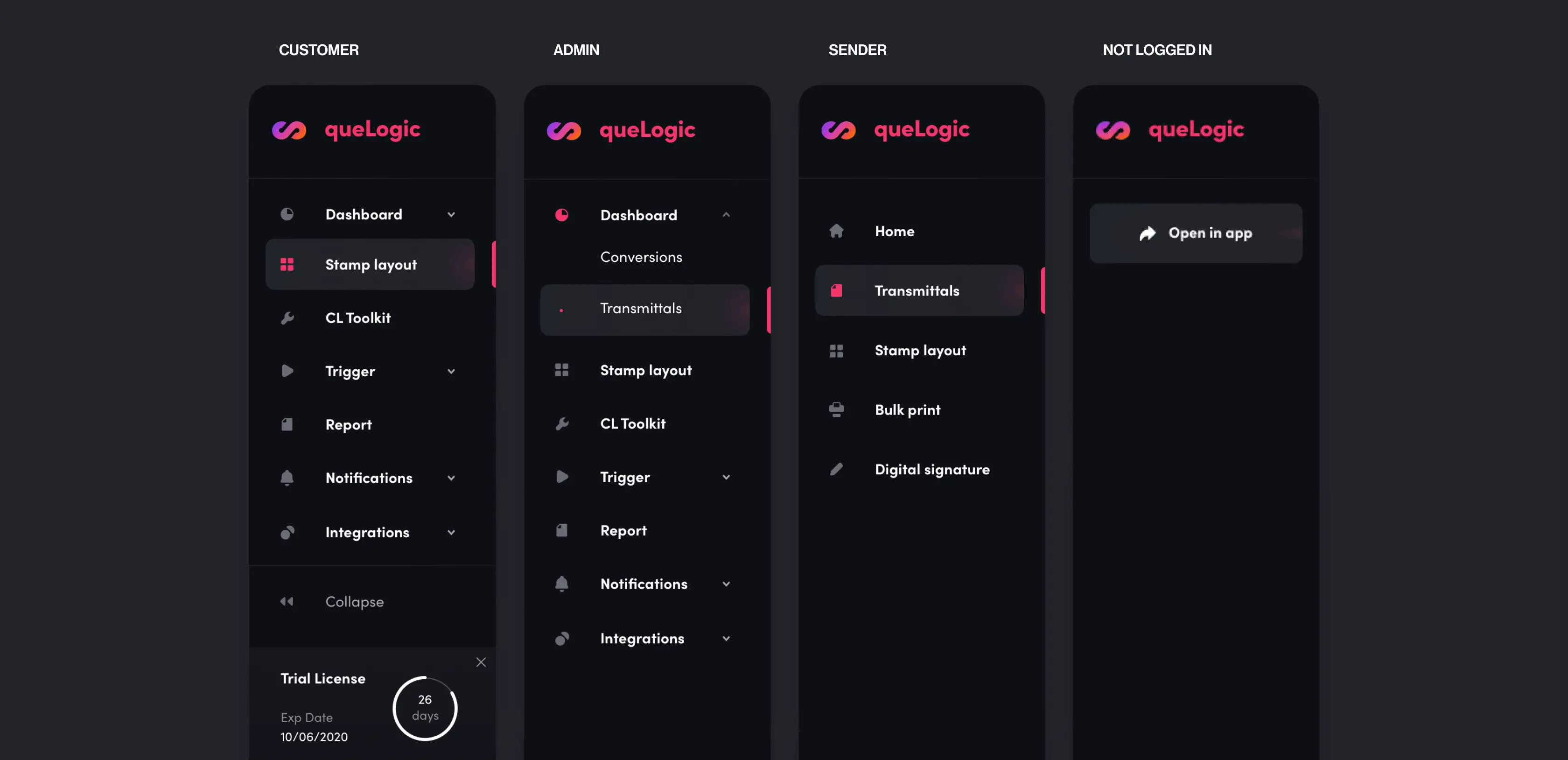
The industrial SaaS UX redesign now supports role-based workflows, ensuring each user sees only relevant tools and data. We implemented role-based interfaces that adapt to engineers, project managers, and technical staff. This ensured each user group sees only the tools and data they need, reducing complexity and improving task focus.
Frequently asked questions
Common questions
about this topic
How can an enterprise workflow optimization platform reduce user task completion time and improve productivity?
Reducing task time requires simplifying navigation, optimizing workflows, and eliminating unnecessary steps. In the Qore8 case, we redesigned the interface and restructured information architecture, resulting in a 65% reduction in document workflow completion time.
What UX strategies improve productivity in enterprise software?
High-performing enterprise platforms focus on role-based workflows, clear visual hierarchy, and fast access to critical actions. Qore8’s redesign introduced tailored interfaces for engineers and managers, helping users complete tasks faster with less cognitive effort.
How can complex industrial workflows be simplified through design?
Complex workflows become manageable when broken into clear, purpose-driven user paths. For Qore8, we aligned navigation with user mental models and operational priorities, allowing teams to move through approvals, conversions, and asset management tasks more efficiently.
Why is role-based interface design important for B2B platforms?
Role-based design ensures each user sees only what is relevant to their job. In the Qore8 platform, this approach reduced interface clutter, improved focus, and increased efficiency for engineers, project managers, and technical teams.
How does improving accessibility impact enterprise product adoption?
Accessibility increases usability for a broader user base and ensures compliance with industry standards. By implementing WCAG improvements for Qore8, the platform became more inclusive while also improving overall usability and reducing enterprise risk.
What are the best ways to increase user adoption after product redesign?
Post-launch adoption improves when interfaces guide users toward valuable actions. For Qore8, we optimized onboarding flows, simplified navigation, and highlighted core workflows, leading to higher engagement and consistent platform usage.
How can an industrial SaaS UX redesign create measurable business ROI?
UX improvements directly impact operational efficiency and productivity. In Qore8’s case, reducing task completion time by 65% and tripling workflow efficiency translated into time savings, lower operational friction, and improved user satisfaction across enterprise teams.
More cases like this
Related cases you
might find useful
How we helped Accern design an AI research product that powered $40M growth and acquisition
Discover how we helped Accern build a powerful AI research tool for analysts and VCs, setting new UX standards now used by AI leaders across industries.
How Lazarev.agency helped Dynascale attract new leads and build an engine for profit growth
See how Dynascale overcame growth challenges with strategic brand revamp & enterprise-grade UX by Lazarev.agency.
How we helped a complex AI SRE tool website boost customer acquisition
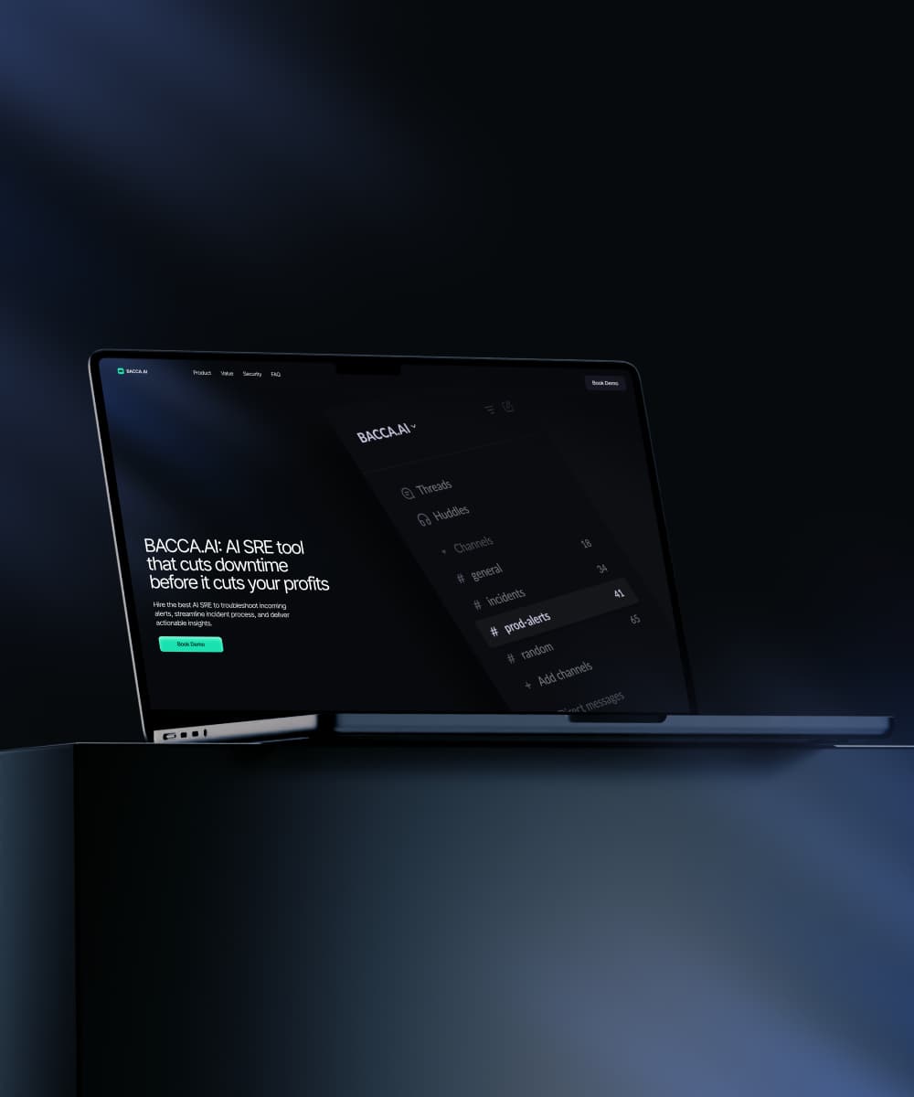
See how Lazarev.agency transformed Bacca AI's complex tech into a compelling story that boosts SRE platform sales.
Let's talk about your AI adoption challenge
Tell us where adoption stalls. You’ll hear back from a senior product and UX lead with a practical action plan.