
Every month you delay investing in design, you end up paying more. Not in physical invoices (at least not right away), but in inflated acquisition costs, suppressed conversion rates, avoidable churn, and eventual redesign cycles.
The tricky thing here is that the true cost of bad design is almost impossible to estimate upfront. It surfaces gradually in performance metrics. Sometimes, it’s even challenging to spot a pattern and attribute it to poor design as a core problem.
In this article, we translate Lazarev.agency’s 10+ years of experience developing design systems across industries into actionable insights. Our team illustrates the concerns clients have brought to us, how overlooking design limits the company’s potential for market differentiation, and why being strategic is a shortcut to smart resource allocation with high ROI.
Key takeaways
- “Functional” is expensive. A product that merely works but lacks strategic UX weakens activation and delays real growth.
- Design debt compounds. What looks like a small UX compromise in year one becomes a structural liability by year three and a forced redesign by year four.
- Redesign is not an upgrade; it’s a full-scale recovery. By the time leadership says “we need to redesign”, the business has already paid in lost deals and opportunities.
Pitfalls of overlooked design
“Enterprise owners come to us with the same concern: ‘We’ve developed both the app and the website in-house. There’s very minimal design on both. Yet, it’s functional. It’s just… It seems to be slightly underperforming.’
What they don’t realize is that “functional” isn’t neutral. In the context of suboptimal business performance, it bears a negative connotation. Merely “functional” means expensive. When design is overlooked, marketing becomes harder, and pitches feel weaker. The money saved upfront turns into lost traction and lost revenue.
Bad design is a growth tax. And companies end up paying it with interest.”
{{Kirill Lazarev}}
Without a solid design system in place from the beginning, your digital product is floating in the air. Interfaces grow inconsistent as features expand, and onboarding feels improvised rather than strategically curated.
That operational discrepancy indicates a much deeper system-level clash that your business will pay for later. Below are 4 underlying pitfalls of suboptimal design.
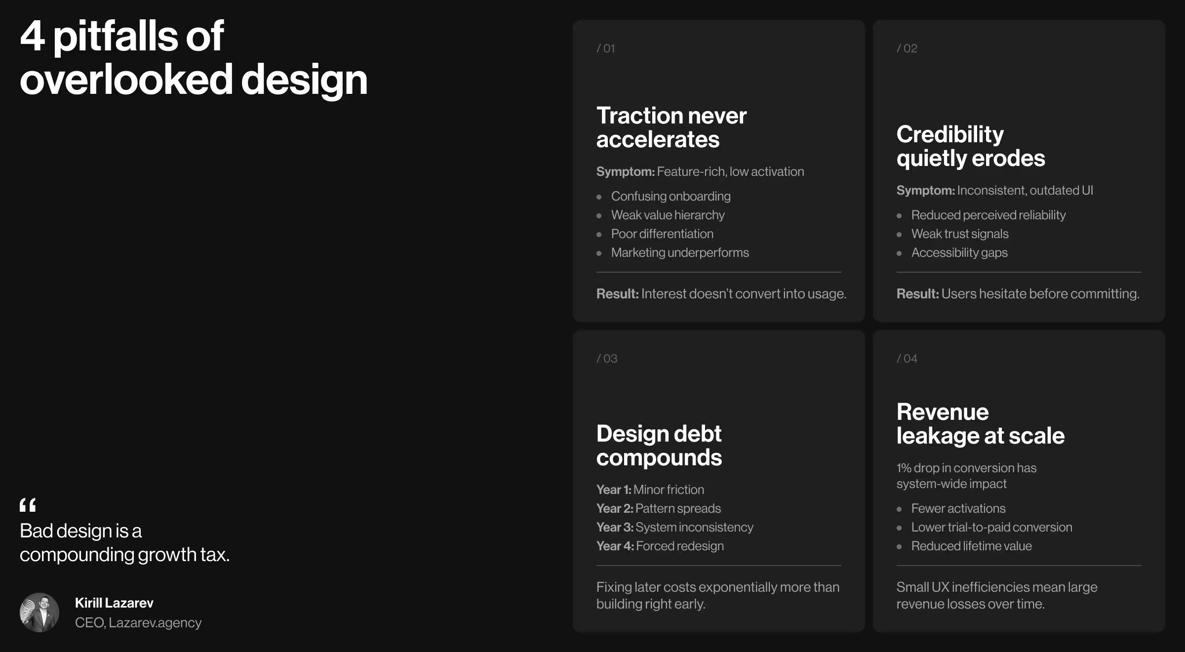
1. Products with minimal design struggle to gain traction
Businesses across industries often try to make their products as feature-packed as possible. As if features alone would guarantee user engagement and conversion. The assumption is that usability can be refined later. In practice, it’s a delayed launch inside the launch.
🟥 Lack of design leads to:
- Confusing onboarding flows
- Unclear value hierarchy
- Weak differentiation
- Delayed marketing readiness
A technically functional product with an unusable design can’t be marketed effectively. Acquisition efforts go to waste because the product does not convert early interest into activation.
💡Statistical insight: Forrester research shows that every $1 invested in UX can generate $100 in return. Meanwhile, Google reports that 53% of mobile users abandon a site if it takes longer than 3 seconds to load. Poor usability doesn’t slow growth — it prevents it from ever taking off.
2. Unoptimized design erodes credibility
Design is the first messenger of your product's maturity. A high-quality interface is an opportunity for strong brand positioning. Suboptimal design is a credibility grinder.
An outdated or inconsistent design introduces doubt (whereas a thoughtful strategy boosts performance):
- Inconsistent UI patterns reduce perceived reliability — solid UI principles win customer trust.
- Poor accessibility suggests a lack of long-term thinking — experience design shows customers your business is user-centered.
3. Design debt compounds faster than technical debt
Technical debt is visible. You see it in bug trackers and performance logs.
Design debt is different. It hides in user behavior and system inconsistencies. You need a design-led instinct to know where it’s accumulating.
The progression follows a pattern:
- Year 1: A confusing flow gets overlooked. Your user audience adapts. The issue appears minor.
- Year 2: The same pattern is replicated across multiple flows. Workarounds become standard behavior.
- Year 3: The inconsistency permeates the system. Multiple features are built around flawed logic. Fixing it would disrupt existing users.
- Year 4: Competitors offer clearer experiences. Users look for alternatives. Redesign becomes non-negotiable.
Fixing design debt later requires re-educating users. That multiplier makes down-the-line correction significantly more expensive than timely investment.
💡Statistical insight: The efficiency difference is measurable. Forrester research on IBM’s Enterprise Design Thinking framework found that organizations reduced initial design and alignment time by 75% when systems were implemented early. Clarity compresses time. Improvisation expands it.
4. Lost revenue from poor conversion optimization
Conversion rates are leverage points. A single percentage point doesn’t look dramatic on a dashboard. But at scale, that one point touches every visitor, every signup, every transaction. It reshapes your entire revenue curve.
A single point drop in conversion translates into:
- Fewer activated users
- Lower trial-to-paid conversion
- Reduced lifetime value
When compounded over months or years, even minor UX inefficiencies yield substantial revenue loss.
Hidden costs of “good enough” design: month-by-month debrief
The cost of bad design unfolds in phases. Early signals appear manageable. A slightly higher bounce rate or a modest increase in customer acquisition cost (CAC) don’t seem all that hurtful at first glance.
The problem is cumulative. What looks like a minor inefficiency in month one becomes a structural gap by month twelve. By the second year, the organization is no longer optimizing growth. It is compensating for earlier decisions.
Understanding the cost of bad design requires examining the timeline.
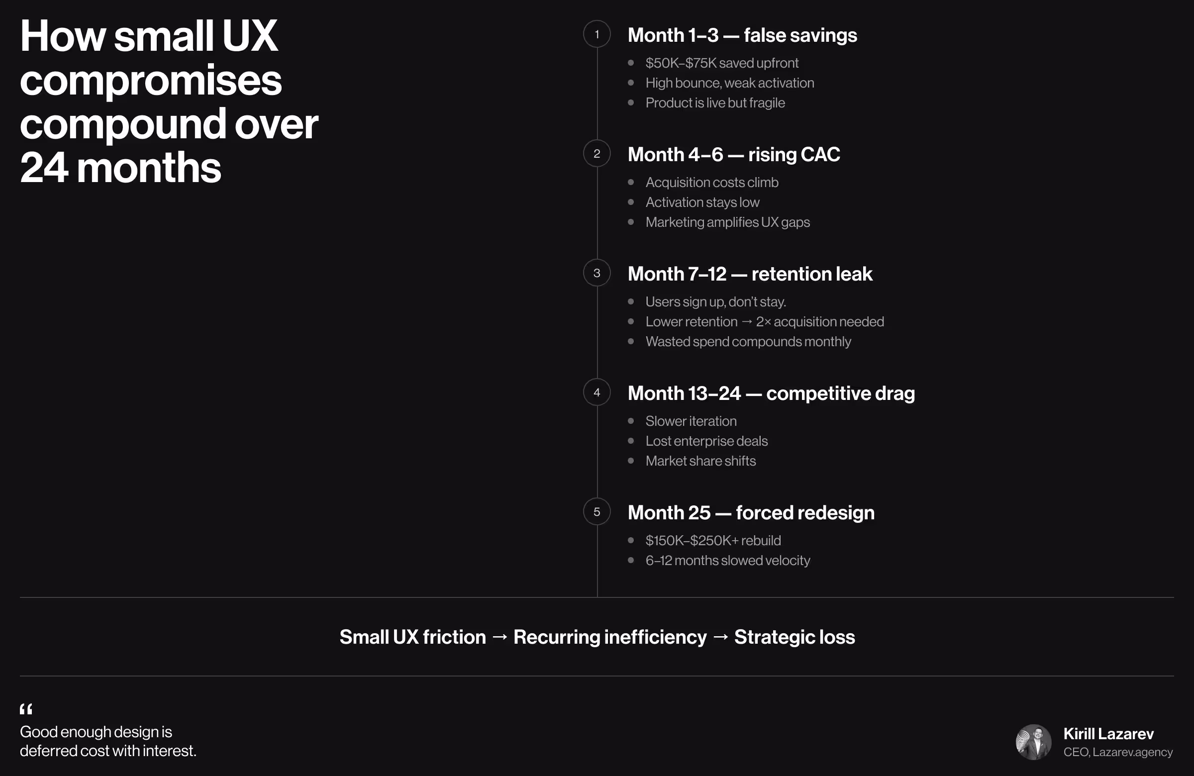
1. Month 1–3: launch costs
In the first quarter, the narrative is optimistic. The team has saved $50K–$75K by limiting design investment and building core features in-house. On paper, this looks efficient.
🟥 Under the surface:
- Users hesitate during onboarding
- Key actions are unclear
- Bounce rate is higher than expected
The product is technically live, but commercially fragile. The most common symptom at this stage is underperformance. The numbers are not strong enough to facilitate growth.
2. Month 4–6: marketing drain
As growth initiatives ramp up, design weaknesses grow more expensive. Marketing cannot compensate for unclear UX. It can only amplify it.
🟥 The financial pattern emerges:
- CAC rises because activation is weak
- Paid campaigns require higher spend to hit targets
- Cost per qualified user significantly exceeds competitors
- Excess acquisition spend accumulates monthly
- Growth feels harder than it should at similar traffic levels
If your CAC is $200 and a competitor’s is $50, you’re already looking into a conversion void. This phase reframes the cost of bad design. The original $50K–$75K “savings” are offset by recurring inefficiency in marketing spend.
3. Month 7–12: retention problems
By the second half of the year, the issue transitions from acquisition to retention. Users are signing up. They are not staying.
🔊 Common signals:
- Confusing onboarding flows
- Feature discovery gaps
- Inconsistent UI patterns
- Support tickets increasing
If your retention is 20% and competitors maintain 40%, you must acquire twice as many users for the same revenue.
🟥 Monthly consequences:
- $20,000–$40,000 in wasted acquisition spend
- Revenue volatility increases
- Forecasting becomes unreliable
Churn compounds, and each cohort underperforms. Growth slows even as marketing spend rises. At this stage, the cost of bad design becomes measurable in cash flow.
4. Month 13–24: competitive disadvantage
By the 2nd year, the cost of design decisions becomes strategic. Competitors with stronger UX foundations iterate faster because they have:
- Scalable design systems
- Consistent interaction logic
- Lower cognitive load across features
- Clearer product positioning
Meanwhile, teams carrying design debt operate in correction mode.
🟥 The strategic impact becomes visible:
- Enterprise deals are lost due to perceived immaturity
- Investors question product viability based on interface quality
- Market share gradually shifts
- Opportunity cost reaches six or seven figures at scale
5. Month 25: redesign decision
Eventually, leadership reaches the conclusion that could have been made at month three: “We need to redesign.”
Now the context has changed: your product has live users and code built around flawed UX assumptions. Besides, it has accumulated design debt across multiple features.
💻 At this stage, redesign encompasses:
- Re-architecting frontend logic
- Updating backend dependencies tied to workflows
- Managing change resistance from existing users
- Handling temporary churn spikes during transition
📈 Cost range:
- $150K–$250K+ for redesign
- 6–12 months of slowed product velocity
- Competitors continuing to ship during your rebuild
This is the full cost curve of “good enough” design.
How to avoid draining costs and invest in a strategy-backed design system
Many businesses view design as a visual promotion of their product. That’s why they fall into the trap of dismissing the need to invest in a solid design system. At the end of the day, why would you spend resources on such a triviality as a product postcard?
That question is fundamentally flawed and yields misleading conclusions.
“Design is the behavioral infrastructure of your business. UX/UI shapes the way your customers interact with your business for the first time or on repeat, how they perceive the value of your product, whether they will be coming back and promote your product without apparent incentive, just because they genuinely enjoyed the experience.”
{{Kirill Lazarev}}
For positive indicators in each category that Anna mentioned (activation, conversion, retention, referral), you need to have a system. And building one is a matter of strategy, research, and best UX/UI practices that would translate theory into practice.
Below is the expert sequence for building a design system that scales with the business.
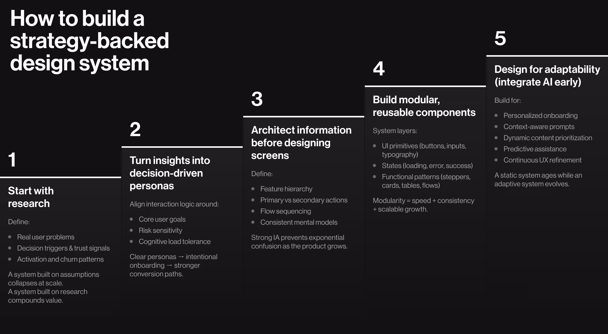
1. Ground the system in market and user research
A design system should not begin with components. It should start with strategy, and strategy begins with research.
🎯 Research defines:
- The real user problem and competitive context
- Decision triggers and trust signals
- Behavioral patterns behind activation and churn
When research is skipped, UI decisions default to internal assumptions. The result is a system built on an assembly of opinions.
Strategic user and market research prevents that. It anchors the design system in market reality, ensuring every pattern and interaction point supports how users think and behave.
2. Translate insights into precise user personas
Treat user personas as insightful decision-making frameworks.
🔄 A strategy-backed system aligns interaction logic around:
- Core user goals
- Risk sensitivity and motivation
- Information tolerance and cognitive load
This alignment shapes new customer onboarding and feature prioritization. When personas are clear, conversion paths become intentional instead of reactive.
3. Define information architecture before visual design
Information architecture (IA) determines how the product thinks.
🪜 It establishes:
- Feature hierarchy
- Primary vs secondary actions
- Logical sequencing of decisions
- Consistent mental models across flows
Improvised IA creates exponential confusion as the product grows. Each added feature compounds structural inconsistency.
In parallel, structured IA, defined early, allows the product to expand without internal conflict. Users build familiarity instead of relearning logic at every step.
4. Build modular, reusable components
Modular designs focus on reusable models that can be potentially dismantled and reassembled. This is essential for businesses planning to add new features or expand to new markets.
Modularity increases product velocity and reduces inconsistency across the design system. Each new feature inherits already validated patterns, making the design operational and scalable.
🧩 Core modular layers include:
- Reusable UI primitives (buttons, inputs, labels, icons, typography)
- Interaction states (default, focus, loading, error, disabled, success confirmation)
- Functional patterns (onboarding stepper, notification logic, card layouts, tables, data grids)
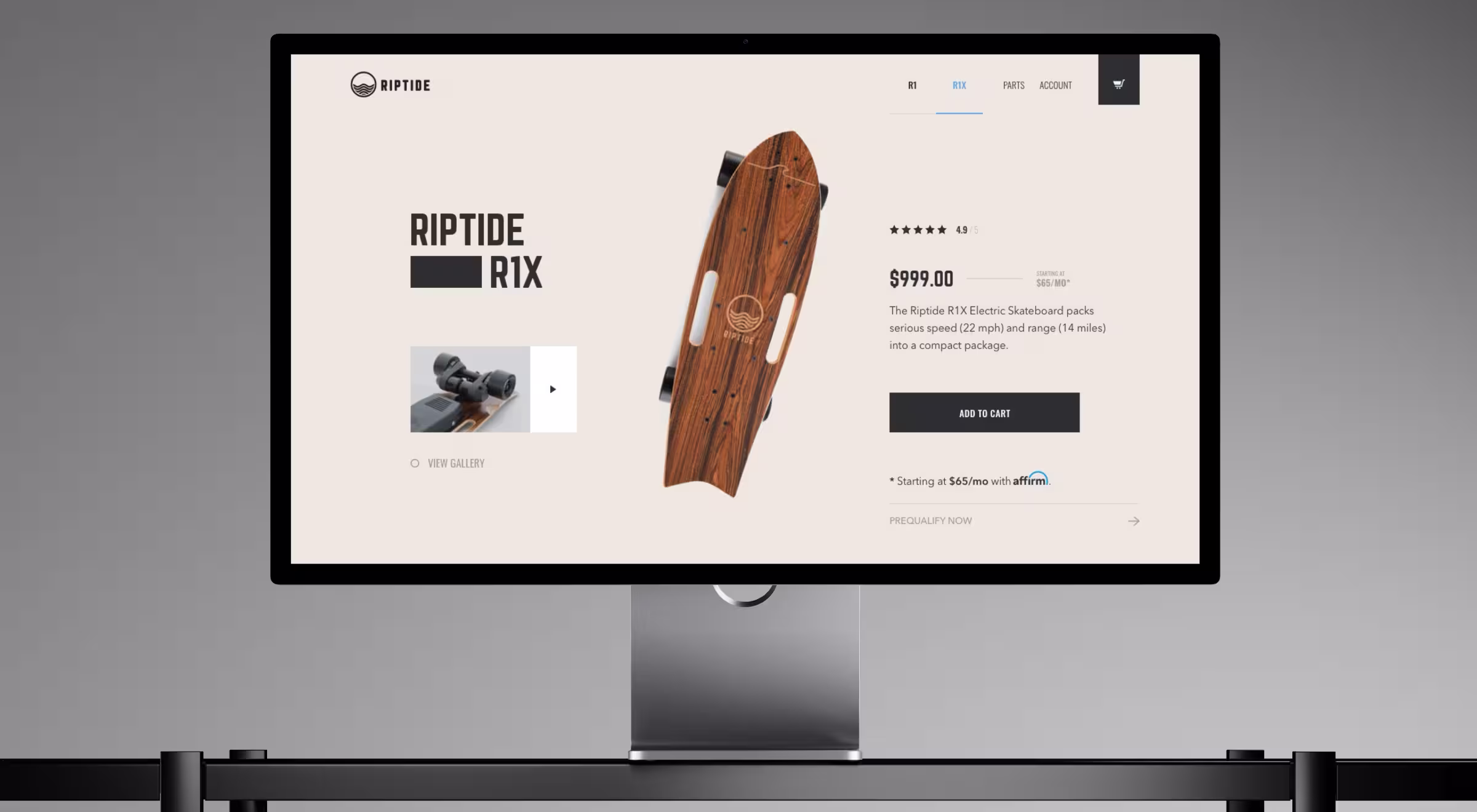
💼 Case in point: In the Riptide redesign, our team embedded modularity across the entire product experience. Product comparison blocks, motion-enhanced media modules, step-based checkout flows, and mobile-optimized parts store layouts were built as reusable system components. This allowed:
- Smooth transitions between the store’s listings
- Structured product storytelling through repeatable content blocks
- A modular, multi-step checkout that reduced cognitive overload
As a result, the system enabled velocity and conversion boost, contributing to a $500K sell-out in two months.
5. Integrate AI tools early
If a design system remains static, it hardens into rigidity and ultimately requires a structural overhaul. Strategic AI integration transforms the design system into a responsive performance layer.
🔄 At the system level, this means designing for:
- Personalized onboarding paths based on intent and behavior
- Context-aware prompts that surface at decision-critical moments
- Dynamic content prioritization based on user signals
- Predictive assistance that reduces time-to-value
- Continuous UX refinement driven by behavioral analytics
When adaptability is built in from the beginning, scaling does not require redesign.
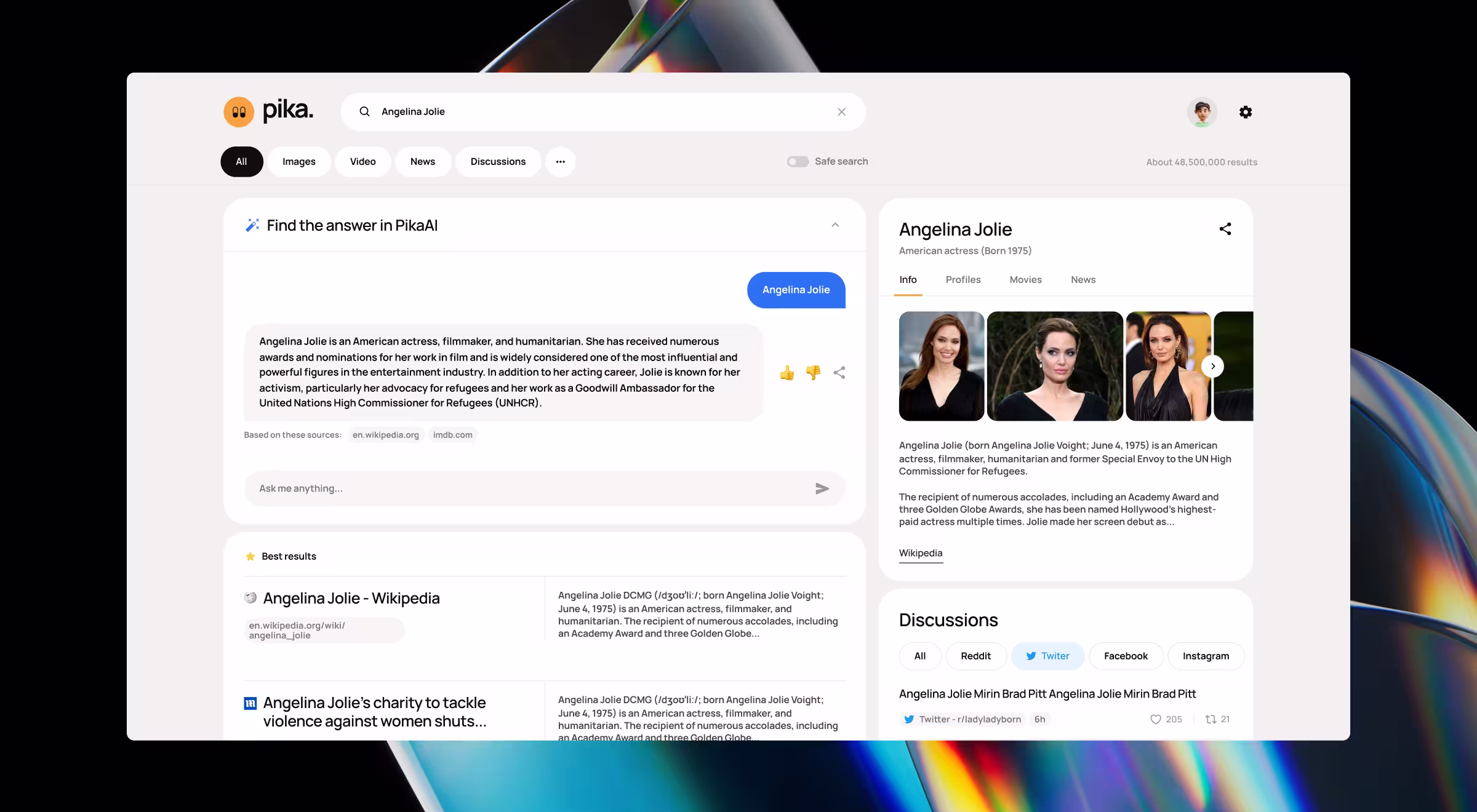
💼 Case in point: In the Pika AI project, AI defined the core interaction logic. The system was architected around AI-powered assistance from the start:
- The AI chat module was strategically positioned directly below the search bar to guide behavior.
- The design system ensured the AI layer remained consistent across desktop and mobile.
- Search results were structured using block-based modules arranged by relevance.
- Personalized widgets were selected and reordered based on user intent.
By designing modular content blocks and interaction logic that respond to query context, our team created a search experience that improves with use.
Invest in quality design early on to avoid paying twice
The cost of bad design shows up in suppressed conversion, sabotaged user retention, and forced redesigns under pressure. What looks like savings in month one becomes excess spending by month twelve.
Strong design does the opposite. It sharpens your brand positioning and compounds revenue over time. A strategic design system reduces the need to fix what should have been structured correctly from the start.
At Lazarev.agency, a result-oriented UI/UX design agency, we design products as business systems built to scale without repeated corrections.
If you want clarity on whether your UX is compounding growth or cost, reach out for expert consultation.


.webp)