How a real estate platform redesign helped a co-ownership startup scale customer acquisition
About the project
CoHome partnered with Lazarev.agency to scale its digital presence and grow market share in the competitive real estate co-ownership space. The objective of the real estate platform redesign was to increase user engagement, improve conversion performance, and position the platform as a trusted entry point for fractional real estate investment.
Through strategic UX improvements and funnel-driven website architecture, we built stronger acquisition flows, elevated credibility, and delivered a scalable platform designed for sustainable growth.
Applied a minimalist design system to simplify investment decisions
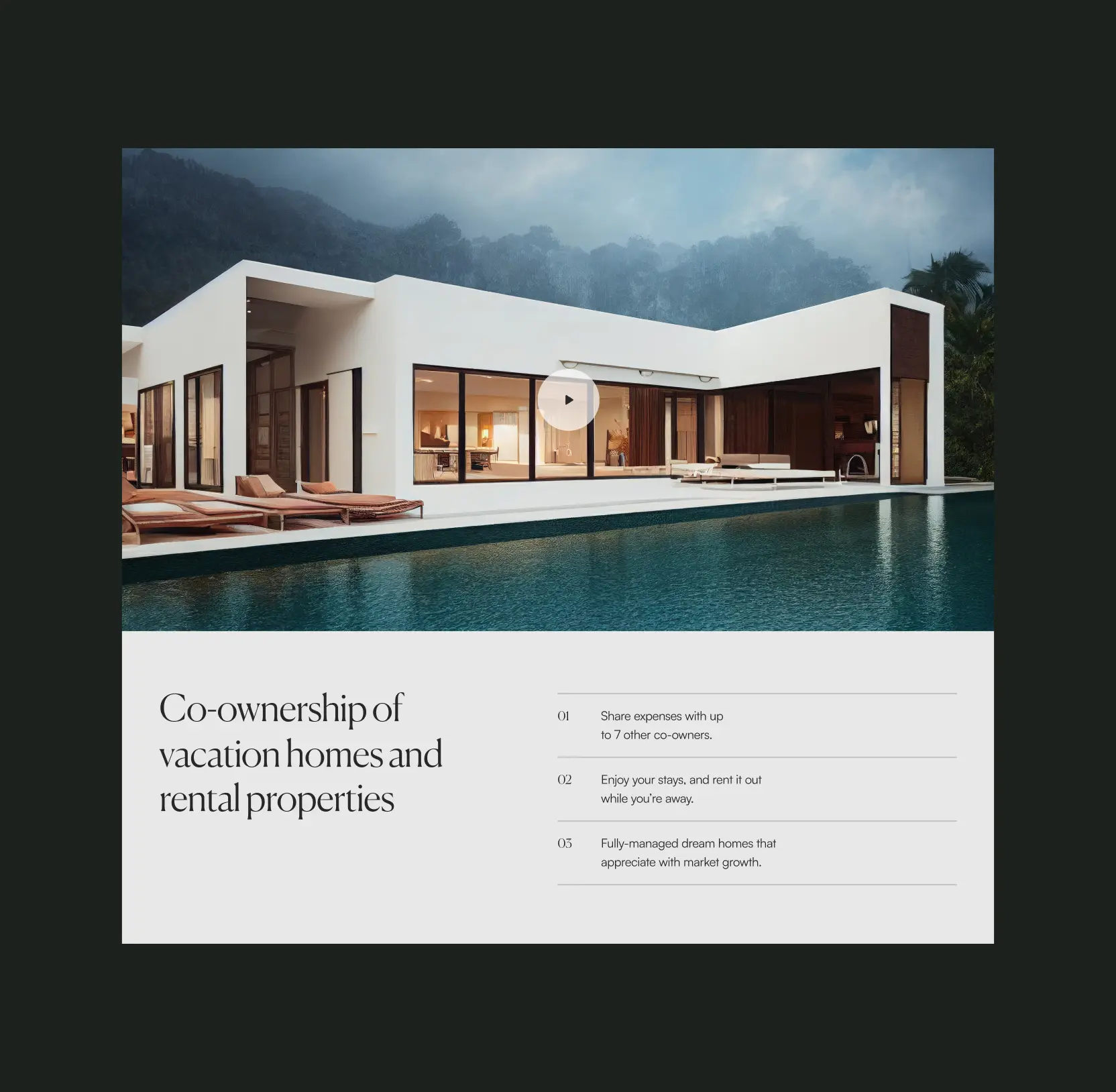
We introduced a clean, minimalist UI with light backgrounds, refined typography, and generous white space. This approach reduced visual noise and improved readability, making complex investment information easier to consume and helping users move confidently through the decision-making process.
10 design system companies behind enterprise-grade UX
Structured the homepage around a sales-driven conversion funnel
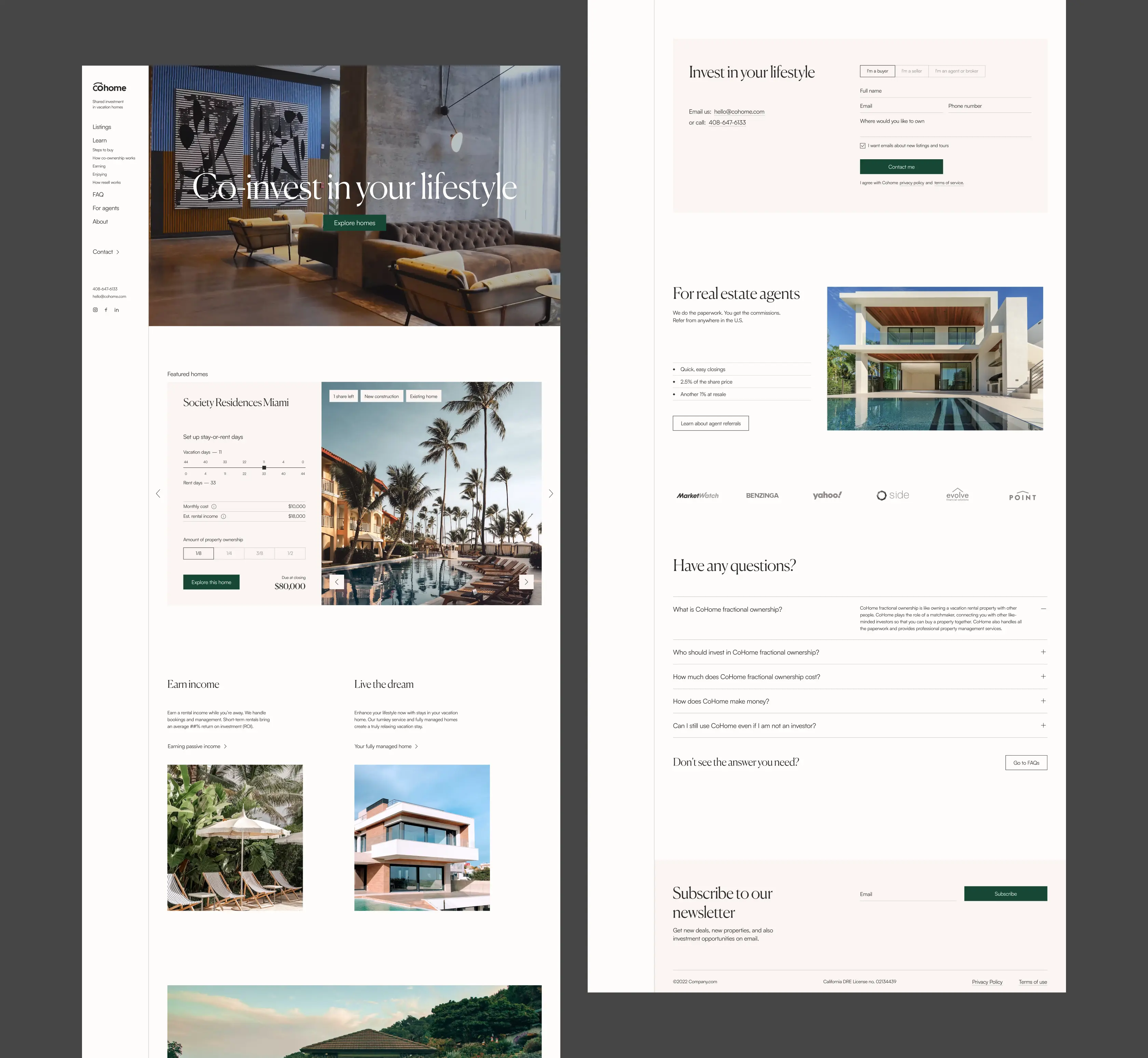
As part of the real estate platform redesign, we rebuilt the homepage as a performance-focused funnel. From the first interaction, users are guided to explore properties and calculate potential returns. This structure immediately engages visitors, shortens the path to value, and increases the likelihood of conversion.
Implemented tools to drive client engagement and growth
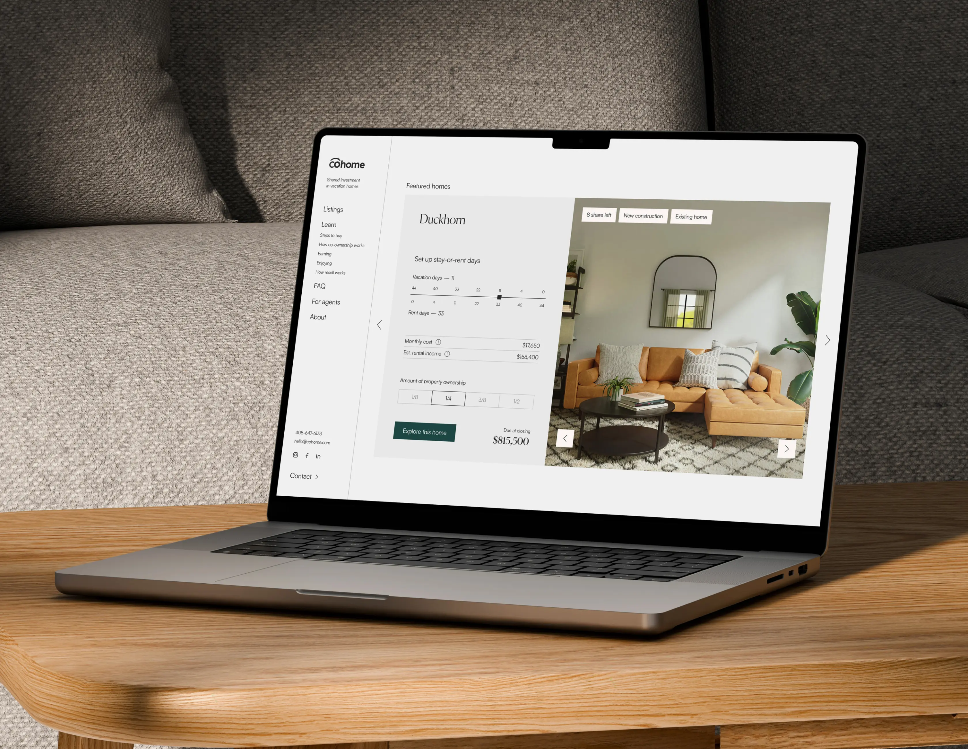
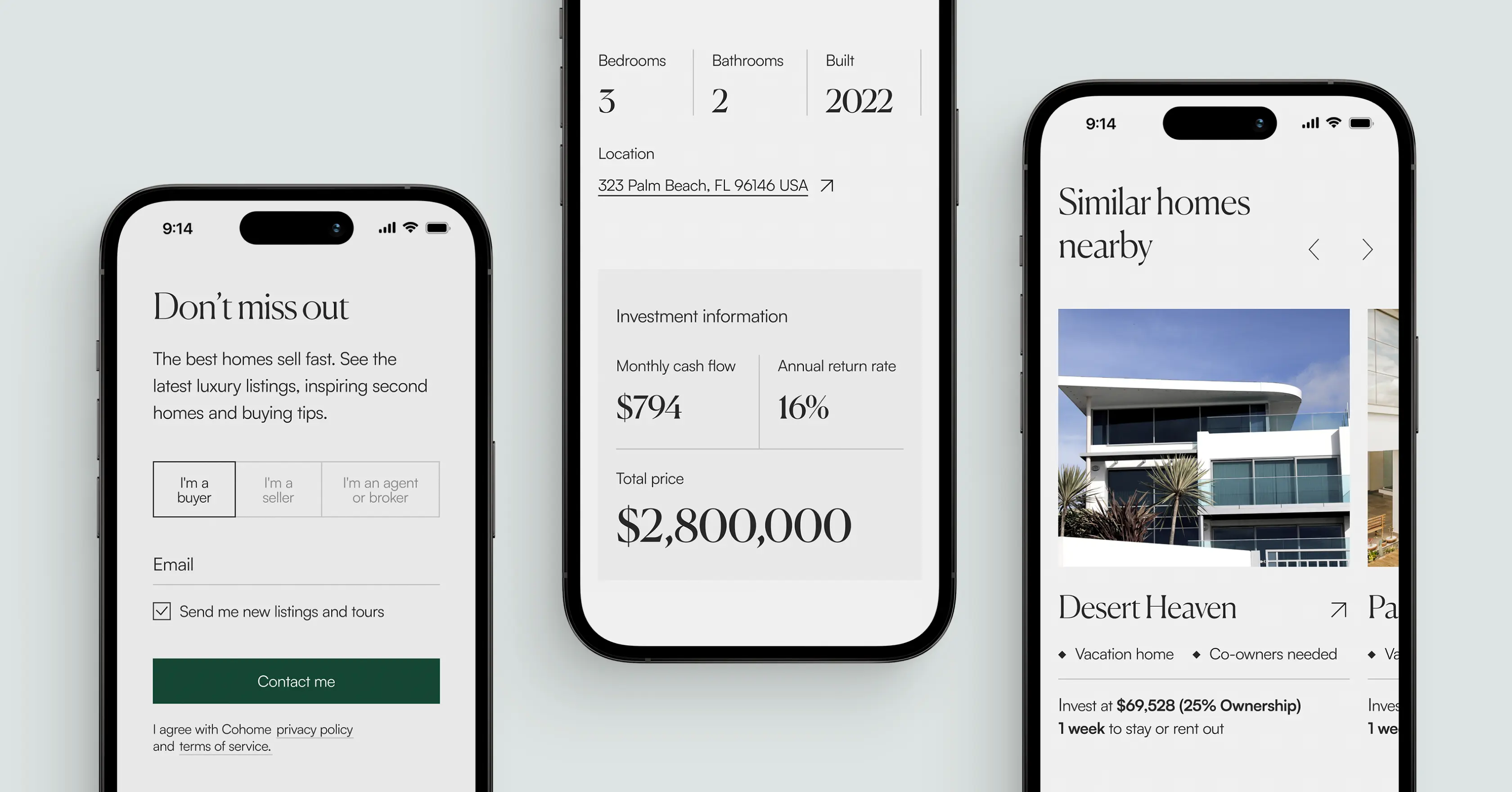
To support new and existing users, we introduced advanced features like a detailed investment calculator and referral program. Clients can explore properties with rich visuals, accurate financial projections, and smart filters, while agents gain access to training materials and marketing resources to drive growth. This real estate platform redesign strengthened acquisition funnels, improved user engagement, and delivered a scalable platform built for long-term growth.
Frequently asked questions
Common questions
about this topic
How can real estate platforms increase user engagement online?
User engagement improves when platforms simplify decision-making and provide immediate value. For CoHome, we introduced a minimalist interface, interactive calculators, and clear property exploration tools that encouraged users to actively engage instead of passively browsing.
What website features help convert visitors into real estate investors?
High-performing real estate platforms use calculators, clear CTAs, and funnel-driven layouts. In the CoHome case, the homepage was structured around property selection and return estimation, helping users move from interest to action faster.
How can fintech and real estate platforms build trust with new users?
Trust is built through transparency, clarity, and accessible data. CoHome’s redesign introduced clear financial projections, clean UI design, and structured content that made investment information easier to understand and verify.
What UX strategies improve conversion rates for investment platforms?
Conversion-focused UX relies on reducing friction and guiding users toward high-value actions. For CoHome, we optimized the homepage flow, simplified navigation, and highlighted core tools like the investment calculator to improve lead-to-client conversion performance.
How can referral programs support growth in digital platforms?
Referral programs create scalable, low-cost acquisition channels. By implementing referral tools and agent resources for CoHome, we enabled existing users and partners to bring in new clients while maintaining brand consistency.
Why is minimalist design effective for financial and real estate products?
Minimalist design improves readability and reduces cognitive overload when users evaluate financial data. CoHome’s clean layout, restrained typography, and whitespace-focused design helped users focus on critical investment information without distraction.
How can a real estate platform redesign increase market share?
A real estate platform redesign increases market share by improving UX, simplifying investment decisions, and boosting conversion rates. Clear layouts, interactive tools, and referral programs build trust, engage users, and encourage repeat activity. Streamlined workflows and data-driven features attract and retain clients, driving scalable growth in a competitive market.
More cases like this
Related cases you
might find useful
How we helped Accern design an AI research product that powered $40M growth and acquisition
Discover how we helped Accern build a powerful AI research tool for analysts and VCs, setting new UX standards now used by AI leaders across industries.
How Lazarev.agency helped Dynascale attract new leads and build an engine for profit growth
See how Dynascale overcame growth challenges with strategic brand revamp & enterprise-grade UX by Lazarev.agency.
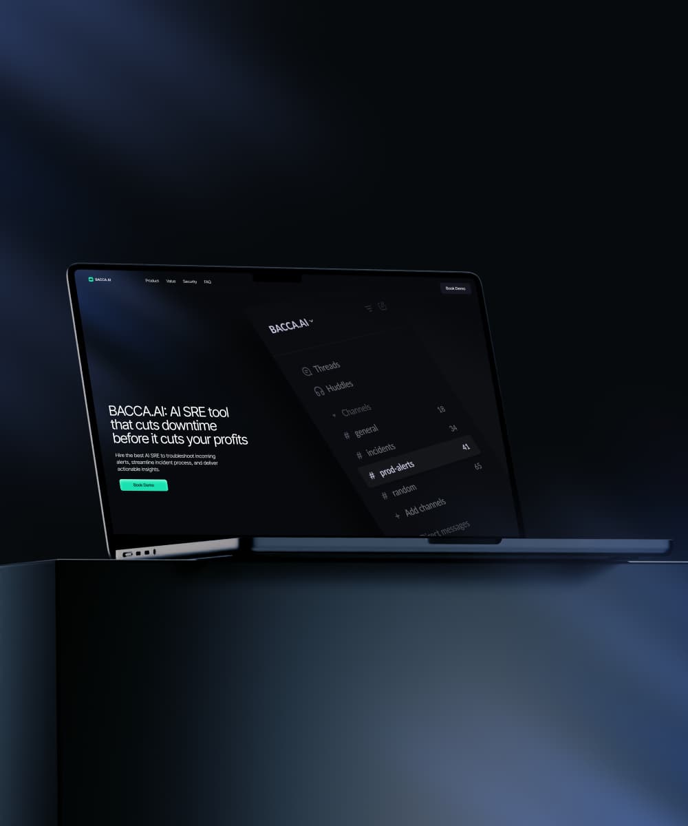
How we helped a complex AI SRE tool website boost customer acquisition
See how Lazarev.agency transformed Bacca AI's complex tech into a compelling story that boosts SRE platform sales.
Let's talk about your AI adoption challenge
Tell us where adoption stalls. You’ll hear back from a senior product and UX lead with a practical action plan.