
“Time and again, we’ve heard enterprise owners express concerns over their data-heavy products struggling to make data usable and accessible. Why? Because they prioritize completeness — depicting all statistical insights available at once — over every other design principle.
This is the core of the problem. Treating a dashboard as a data container leaves your users disoriented and largely confused. Conversely, approaching it as a strategic decision system is a shortcut to strengthening your product’s value.”
{{Kirill Lazarev}}
Designing data-heavy dashboards starts with understanding the product’s core purpose, user roles, broader decision contexts, and the speed at which actions should happen.
In this article, we’ll walk through how data dashboard design works in practice and how a strategic approach transforms intricate datasets into reliable decision systems.
Key takeaways
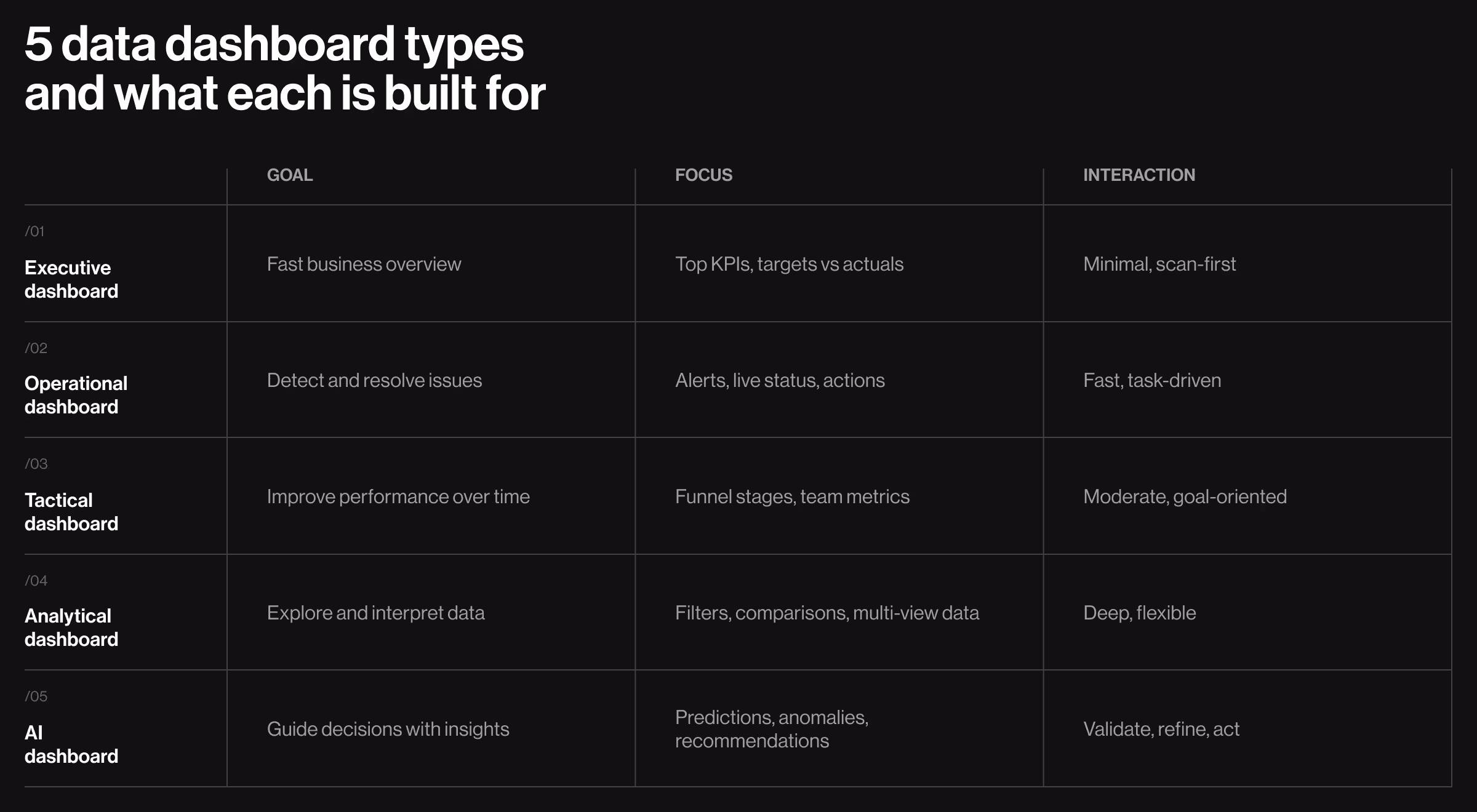
- Dashboard type defines design logic. Executive, operational, analytical, and AI dashboards solve different decision problems. Applying a single structure across them leads to misaligned priorities and weaker outcomes.
- Hierarchy decides whether data gets used. Users don’t process everything on the screen. What’s surfaced first shapes interpretation and, ultimately, the decision.
- Strategy separates usable dashboards from data containers. Strong dashboards are designed around user roles and decision contexts.
5 types of data dashboards: actionable insights into what makes each design unique
Data-dense platforms don’t share a universal dashboard structure. A dashboard built for an executive cannot follow the same logic as one used by an analyst or an operations team. Each calls for a unique balance between data visibility and user oversight.
Understanding these differences is the first step toward designing dashboards reflective of real product use.
1. Executive dashboards
Executive dashboards help users make informed decisions under time constraints. What makes this dashboard type stand out is the need to compress abundant data sources into a clear, reliable snapshot of business health.
🧩 Design must emphasize:
- Hierarchy of key performance indicators (KPIs). Core business metrics (revenue, growth, conversion rates, retention) must be immediately visible. Supporting metrics should hold a secondary position.
- Clear comparative context (targets vs actuals). Numbers without reference points sabotage decision-making. Each KPI should include context — targets or benchmarks — to make performance interpretable.
- Scannable visual layout with predictable structure. Information should follow a consistent top-to-bottom or left-to-right logic. For executives, a stable information architecture (IA) reduces the need to re-interpret the interface every time they return to it.
- Minimal interaction with intentional depth. The primary view should answer key questions right away. Drill-down capabilities should be secondary and unobtrusive.
💻 Practical example: A strong reference point is the executive overview in Google Analytics. Its structure reflects executive logic:
- Key metrics are surfaced immediately (users, sessions, revenue). The dashboard provides a clear snapshot of website/app performance.
- Comparative context available for each metric. It shows changes over time without requiring additional input from the user.
- Visual hierarchy is consistent across the UI. Users can scan and grasp the current state of business performance within seconds.
- Deeper analysis remains accessible yet separated. The primary view is uncluttered.
What this example gets right is the consistency in structuring considerable volumes of data. It prioritizes clarity over completeness, which is the key attribute of an effective executive dashboard.
2. Operational dashboard
Operational dashboards support real time monitoring, helping users oversee transactions and live processes where every second counts.
Unlike executive dashboards, which compress performance, operational dashboards surface disruption. Their role is to shorten the path from issue detection to an actionable response.
🧩 Design must emphasize:
- Priority-driven layout. Critical events and active tasks must dominate the UI. Alerts and anomalies should appear in primary positions with respective visual weight.
- Persistent visibility of the system status. Key indicators should always be within reach to ensure users stay aware of what matters most while navigating different parts of the dashboard.
- Fast, low-effort interaction loops. Filtering, sorting, and switching views should take minimal input to avoid interrupting users’ workflows.
- Action proximity to insight. Each surfaced item should be paired with a direct action like approve, resolve, investigate, or execute.
💻 Practical example: The Metastaq dashboard, designed by Lazarev.agency, reflects an operational structure adapted for Web3 product workflows.
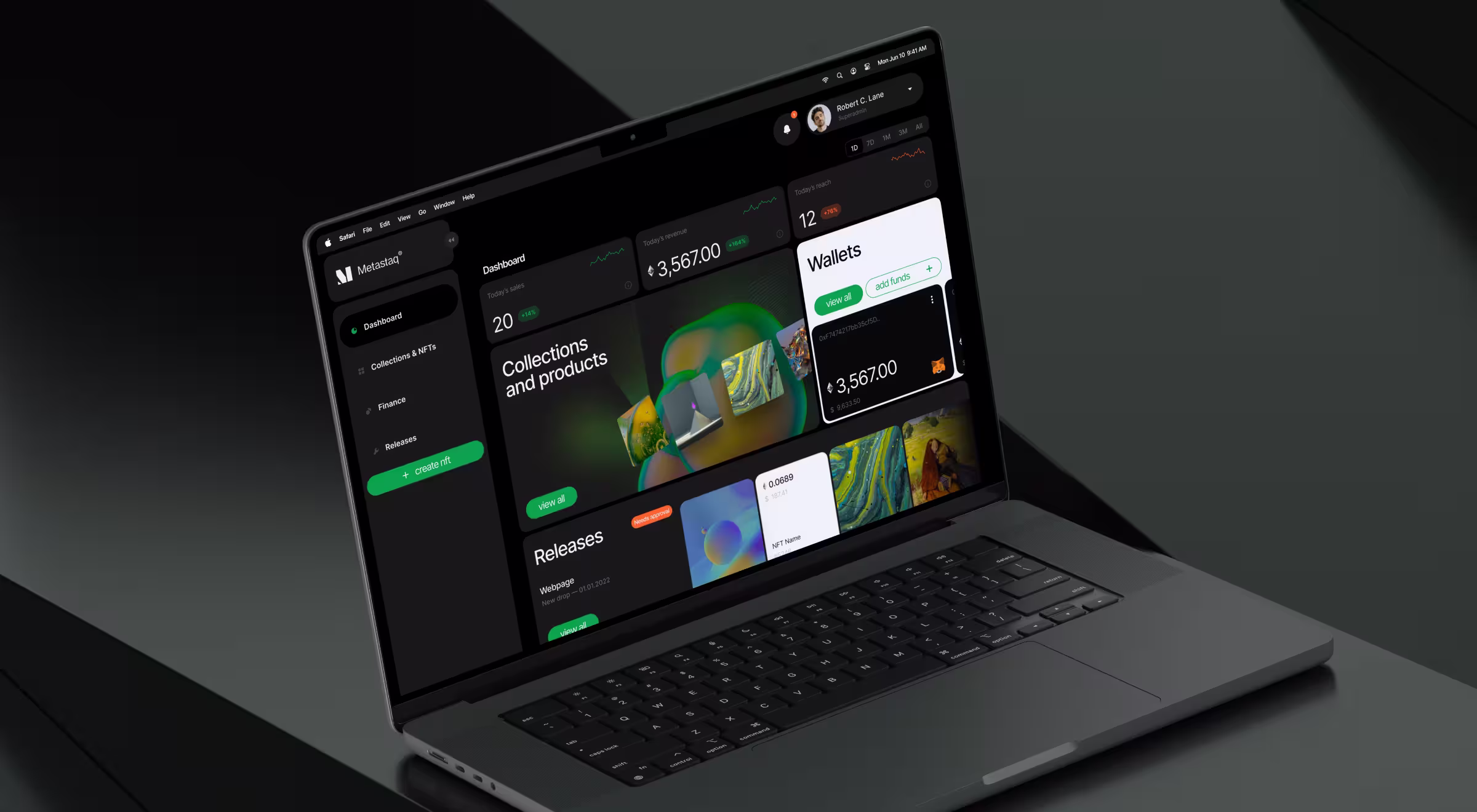
Here’s how the design supports operational use:
- Top-layer system pulse. KPI widgets such as sales, revenue, and reach are positioned at the top. Users can track platform activity at a glance.
- Centralized operational focus (priority-driven layout). The core area highlights collections, products, releases, and wallet activity. Frequently used functions take visual priority.
- Task-first UI structure. The “Releases” block surfaces items requiring approval alongside status indicators. Users can identify pending actions without navigating across multiple sections.
- Embedded actions within context. Controls such as “View All” and “Add Funds” are placed directly within modules. Financial panels let users monitor balances and top up accounts while staying on the main dashboard.
- Layered visibility. High-level indicators remain at the top, while operational blocks occupy the center. This supports a natural transition from monitoring to execution.
Metastaq dashboard reinforces what defines an effective operational dashboard: priority-led layout and immediate access to action.
🔍 Have a look at our Lead Designer’s practical take on how to structure an NFT dashboard.
3. Tactical dashboard
Tactical dashboards sit between strategic overview and deep analysis. They are built for teams responsible for moving metrics week over week.
The structure follows a goal-oriented logic. Metrics are grouped by objective, task ownership, funnel stage, or workflow step. This alignment allows teams to read business performance in context and act with direction.
🧩 Design must emphasize:
- Goal-linked grouping. Metrics are organized by objective (e.g., acquisition, activation, retention). This mirrors how teams operate and helps optimize the performance audit.
- Stage-based structuring. Data is mapped to workflow stages (e.g., funnel steps, campaign lifecycle), which helps teams identify where performance changes direction.
- Action-oriented context. Supporting indicators (conversion rates, drop-offs, time intervals) sit next to primary metrics to guide next steps.
- Balanced density. Enough information to support decisions, but arranged in a way that preserves scanability during frequent use.
💻 Practical example: HubSpot qualifies as a tactical dashboard because it is built around ongoing performance management. Teams use it daily to monitor campaign results and conversion movement across funnel stages.
The interface organizes data around how work is executed:
- Traffic → leads → opportunities → deals
- Campaign performance tied to specific channels
- Conversion rates at each stage of the funnel
This structure allows teams to spot where performance drops and what needs adjustment.
4. Analytical dashboard
Analytical dashboards serve users who manipulate data to identify patterns, relationships, and performance-related drivers and barriers.
What makes this type distinct is its focus on flexibility over speed. It does not prioritize a single narrative. Instead, it provides a structured environment where users can look at data from multiple angles and build their own understanding.
🧩 Design must emphasize:
- Layered data exploration. The interface should allow users to move smoothly from generalized high-level signals to a detailed view.
- Advanced filtering and segmentation controls. Filtering here serves as the primary interaction modality. Users must be able to isolate specific variables and adjust parameters on demand.
- Multi-view data representation. The same dataset should be accessible through different visual elements, e.g., pie charts, bar charts, and tables, depending on the user’s analytical goal.
- Simultaneous context across datasets. Analytical work often involves comparing multiple signals at once. The interface should provide context to enable comparative analysis.
💻 Practical example: Our design of the Blockbeat dashboard illustrates how an analytical environment supports ongoing data exploration across multiple dimensions.
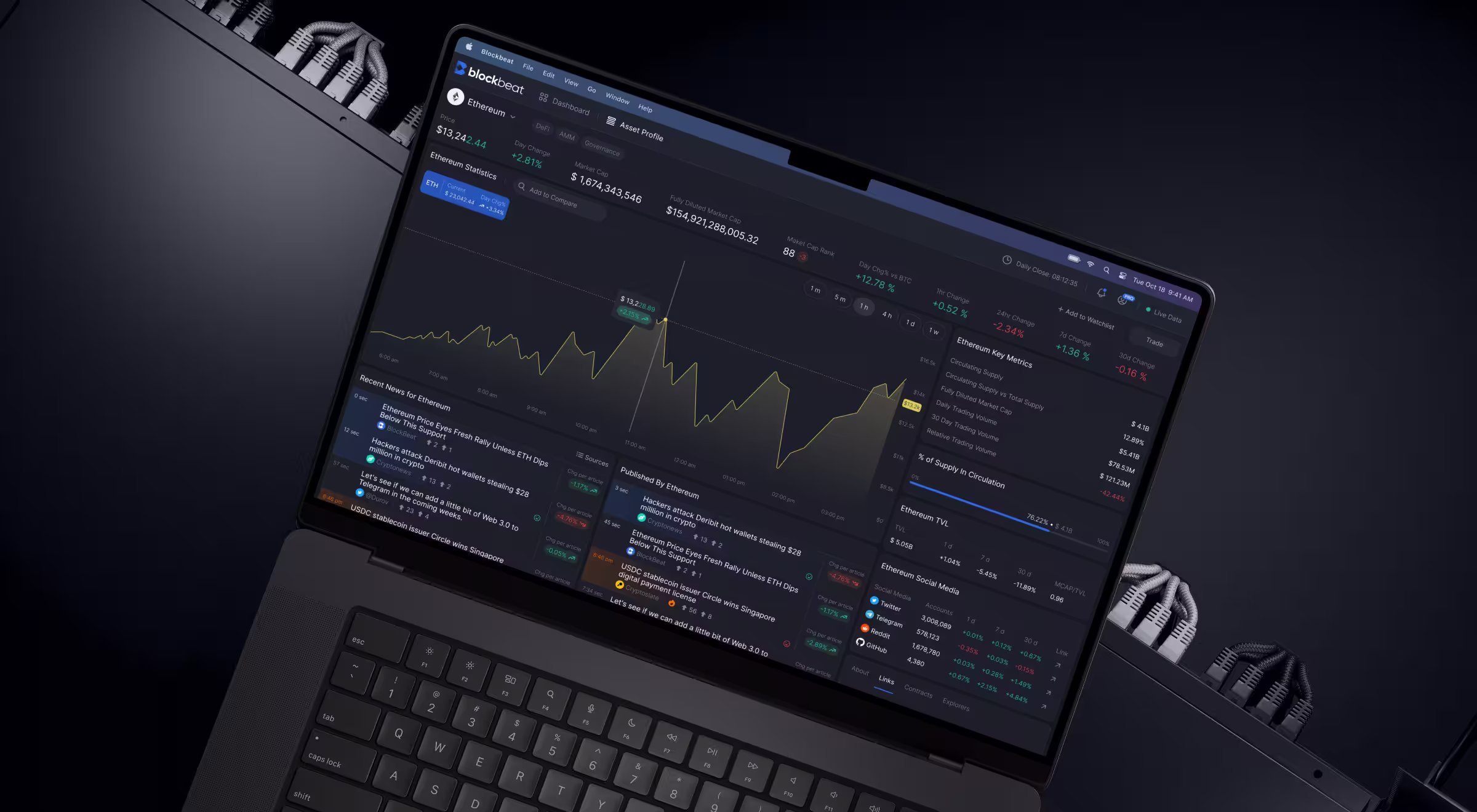
Here’s how the design supports analytical applicability:
- Multi-stream data layout (left → center → right). A continuously updated news feed sits on the left, article expansion happens in the center on hover, while market statistics and watchlists occupy the right. This arrangement exposes different data sources and formats for users to explore.
- Deep filtering and feed control. Users can refine content by source, asset, and category, while the pause function disables incoming updates to ensure uninterrupted analysis.
- Contextual linking between events and market impact. News articles include AI-driven tags, and a dedicated widget shows how events affect asset performance. Adjustable timeframes and data visualization formats help users compare important data points across different periods.
- Customizable market statistics and visualization. Market widgets adapt to user priorities, with selectable time ranges and chart formats. Comparative views allow multiple assets to be analyzed side by side.
- Asset-centric deep dive environment. Each asset has a dedicated view with real-time stats, performance graphs, related news, and comparative data. Users move from broad exploration to focused investigation while retaining the surrounding context.
- Structured visual system for high-density data. A dark interface reduces strain during extended use, while color accents signal trends and states. Modular cards organize large volumes of information as digestible units, supporting sustained analytical workflows.
🔍 Explore our dedicated case study to learn more about Blockbeat’s redesign.
5. AI dashboard
AI dashboards are fundamental tools for guided decision-making. They do not stop at presenting data insights. They interpret patterns, surface anomalies, forecast future trends, and suggest next steps.
🧩 Design must emphasize:
- Insight-first structure. The interface should prioritize surfaced insights, like anomalies and predictions, before raw metrics. Here, data supports the insight, not the other way around.
- Explanation alongside every output. Each AI-generated signal must explain the reasoning behind itself. Users have to understand what triggered the system output, which variables contributed, and how confident the system is.
- Separation between system interpretation and raw data. Users should always distinguish between what the system suggests and what the data shows.
- Actionable pathways embedded into insights. Every surfaced recommendation should lead to an action: resolve, investigate, adjust parameters, escalate, etc.
- Feedback loops for user validation. Users must be able to confirm, reject, modify, or question AI outputs. This interaction strengthens trust and improves system performance over time.
💻 Practical example: Our design of the Bacca AI dashboard shows how an AI-driven interface supports real-time decision-making in Site Reliability Engineering (SRE) environments.
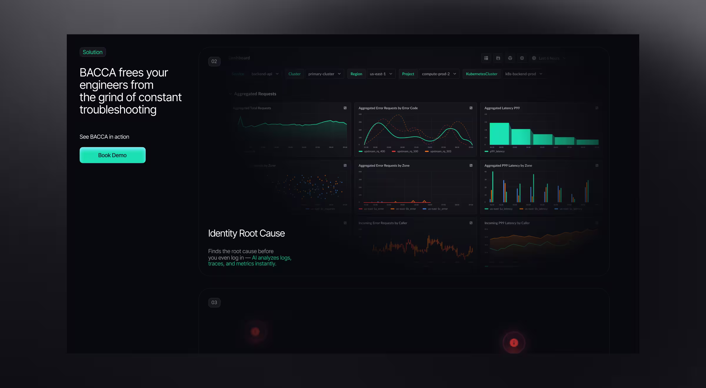
Here’s how the design makes AI capabilities understandable and trustworthy:
- Insight-first monitoring of system behavior. The dashboard prioritizes signals such as error rates and anomaly patterns across services. The UI surfaces deviations as primary indicators.
- Structured relationship between metrics and incidents. Visualizations such as aggregated error requests and latency distributions provide supporting context for each detected issue. Users can trace how system behavior evolves over time and across zones.
- Separation between observed data and interpreted signals. Raw metrics — error rates, latency values, request distributions — are presented alongside system-generated insights. This allows users to validate conclusions against underlying data.
- Direct path from detection to resolution. The platform integrates automated root-cause analysis and resolution flows. Once an issue is surfaced, users can proceed with deeper analysis or trigger system-level responses.
- Focused visual system for sustained monitoring. A dark interface with high-contrast data points supports long monitoring sessions. Color is used to highlight deviations and trends, helping users identify changes in performance.
🔍 For a more detailed breakdown of Bacca AI’s platform design, explore our case study.
5 core UX/UI principles behind strong data dashboard designs
The difference between dashboards people trust and dashboards they pay no attention to comes down to how that data is structured.
Across industries — fintech, AI, SaaS, Web3 — the strongest dashboards share a consistent set of UX/UI attributes. While their visual language and primary data model may (and more often than not they do) differ, the underlying design logic remains largely the same.
These principles define how attention is guided and how quickly users move from observation to action.
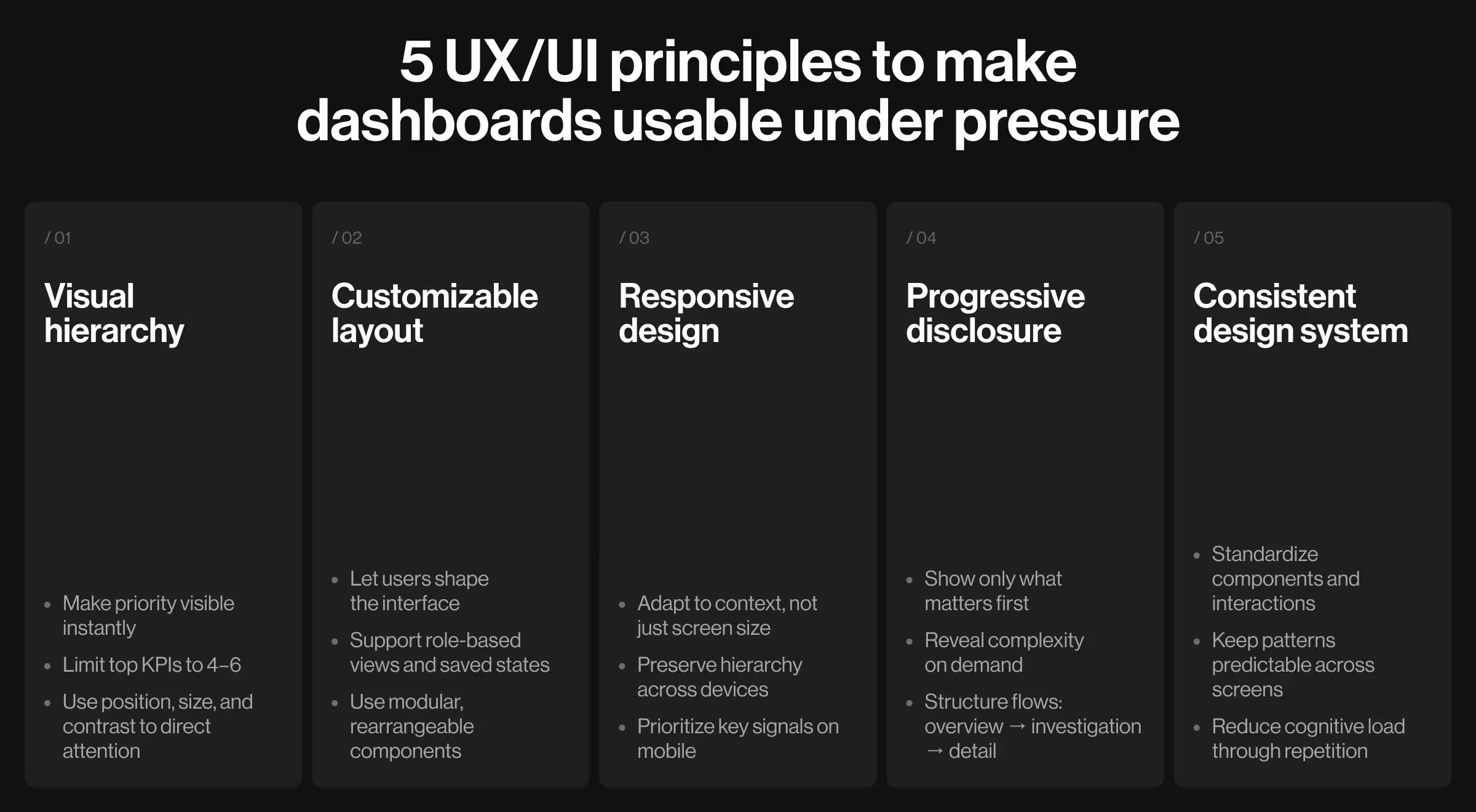
1. Visual hierarchy
Visual hierarchy determines how users interpret information within the first few seconds of interaction. It establishes priority before any interaction takes place.
What to focus on:
- Position primary KPIs in the top left corner or top-center zones
- Assign larger typography and stronger contrast to key metrics
- Use spacing to structure logical groups and minimize visual noise
How to apply it:
- Start with a single primary question the dashboard must answer (e.g., “Are we hitting targets?”) and design around it.
- Limit top-level KPIs to 4–6 metrics. Move supporting data into secondary layers.
- Use color as a strategic state indicator.
💡 Tip from Lazarev.agency’s team: Design hierarchy as a decision path. Every element should lead users toward understanding what matters first.
2. Customizable dashboard layout
Different audiences interpret the same dataset in different ways, and users look to your product to reflect that variability.
This shift is evident in broader behavior trends: according to a McKinsey report, 71% of consumers expect personalized interactions, while 76% feel frustrated when those needs are not met.
A fixed layout assumes uniform priorities across users, which is a fragile assumption in itself.
What to focus on:
- Modular components that can be rearranged
- Saved views aligned with user roles/workflows
- Optional layers for deeper exploration
How to apply it:
- Introduce drag-and-drop widgets for key modules (KPIs, charts).
- Allow users to save multiple dashboard states (e.g., “Executive view”, “Marketing view”).
- Enable toggling between simplified and detailed modes.
💡 Tip from Lazarev.agency’s team: Treat personalization as a core UI feature. When users have the option to shape the UI around their goals, your product gets much easier to operate.
3. Responsive design
Dashboards are accessed across devices and contexts. The desktop remains the primary ground for deep work, while mobile serves as a quick vantage point for fast checks.
Yet no single interaction mode consistently takes center stage. By making your design responsive, you kill two birds with one stone.
⚖️ Still weighing the pros and cons of responsive design for your platform? Make an informed decision by considering these 5 reasons to invest in responsive design.
What to focus on:
- Consistent visual hierarchy across screen sizes
- Flexible interaction patterns for touchscreen environments
- Focus on important data points on smaller screens
How to apply it:
- Define breakpoint-specific layouts.
- Present secondary modules as expandable sections on mobile.
- Replace hover interactions with tap-based alternatives.
💡 Tip from Lazarev.agency’s team: Design responsive behavior around user intent per device. Desktop supports analysis, mobile supports quick validation.
4. Progressive disclosure
Data-dense dashboards require layered access to information. Users should see only what is relevant at each stage of interaction.
What to focus on:
- High-level overview as the entry point
- Expandable sections for deeper inspection
- Contextual reveal of additional data
How to apply it:
- Use drill-down interactions for detailed data.
- Introduce hover or click states for additional context (tooltips, breakdowns).
- Group advanced controls behind expandable panels.
💡 Tip from Lazarev.agency’s team: Structure dashboards in levels of intent: overview → investigation → detailed analysis. Each level should feel purposeful and connected to the dashboard as a system.
5. Consistent design system
Every growth-oriented product needs a design system. For data-dense products, consistency transforms a dashboard from a collection of screens into a coherent environment. When patterns hold, users shift their focus from how to use the interface to what the data is telling them.
What to focus on:
- Standardized components (cards, charts, filters, tables)
- Unified interaction patterns
- Predictable visual language
How to apply it:
- Define reusable UI components with fixed behaviors (e.g., all charts share the same interaction model).
- Maintain consistent spacing, typography, and color usage across modules.
- Document interaction rules for filters and data updates.
💡 Tip from Lazarev.agency’s team: Build dashboards as part of a system. The more patterns repeat, the less users have to think about the interface, which, in turn, frees up cognitive bandwidth for more confident actions.
Best practices for designing dashboards for data-heavy digital products
Most data-dense dashboards reach a point where surfacing more information doesn’t add value. The interface expands while users slow down.
Effective dashboards help resolve this dilemma. The practices below outline how to shape dashboards so they support real product use.
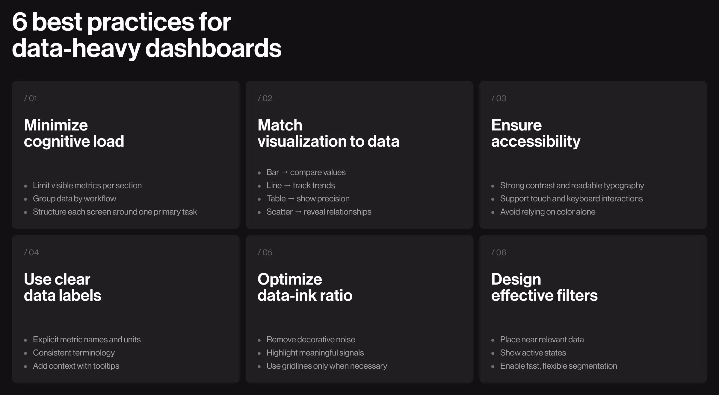
1. Minimize cognitive load
Data-heavy interfaces can tire users out fast. When information is scattered, users end up untangling the UI before they can actually get anything done.
From a UX perspective, reducing cognitive load means organizing information to match how users think and act.
📋 Implementation tips:
- Limit the number of visible metrics per section
- Group related data by workflow (e.g., acquisition → conversion → retention)
- Remove duplicated metrics across modules
- Use spacing and layout boundaries to separate distinct areas
- Define a primary task for each screen and structure content around it
2. Use visualization aligned with the type of data displayed
How information is visualized determines how easily users grasp it. When the format doesn’t match the data type, confusion creeps in.
Each dataset should use the right visualization matching its purpose. It could relate to comparing values, tracking trends, analyzing time-bound performance, or forecasting outcomes.
📋 Implementation tips:
- Use bar charts for comparing values across categories
- Use line charts for tracking changes over time
- Use tables for precise values and detailed breakdowns
- Use scatter plots for identifying relationships between variables
- Avoid applying the same chart type across different datasets
3. Make data accessible and usable
Dashboards operate across different devices, lighting environments, and unique user capabilities. Accessibility in UX design means ensuring usability remains consistent in all of the enumerated contexts.
📋 Implementation tips:
- Maintain a strong contrast between text, charts, and background
- Use icons, labels, or patterns alongside color indicators
- Ensure typography remains legible across screen sizes
- Design interactive elements with sufficient size for touch input
- Support keyboard navigation for critical actions where relevant
4. Feature clear data labels
Data only works if users can tell what each metric means right away. Clear labels give the context users need, so they don’t have to pause to figure it out.
📋 Implementation tips:
- Define metrics with explicit naming (e.g., “Weekly Active Users”)
- Include timeframe and units directly in labels
- Maintain consistent terminology across all modules
- Avoid internal abbreviations unfamiliar to users
- Add tooltips or micro-descriptions for more detailed context
5. Ensure data ink ratio
The data-ink ratio is the proportion of a chart’s ink that conveys actionable insights. A high data-ink ratio keeps the focus on what matters, using visual space to highlight meaningful information.
📋 Implementation tips:
- Remove unnecessary decorative elements
- Simplify chart designs to highlight key data points
- Use gridlines only when they support data interpretation
- Prioritize data visibility over visual styling
6. Use interactive filters for improved data organization
Filters allow users to shape the dataset based on their needs. Well-designed filtering systems enable users to focus on relevant data without leaving the interface.
📋 Implementation tips:
- Place filters close to the data they affect
- Use multi-select options for flexible segmentation
- Display active filters to maintain awareness
- Ensure immediate updates after filter changes
- Group filters logically (e.g., time range, category, region)
Ready to design an insightful data dashboard?
Data-heavy products succeed when dashboard designs guide users’ decisions. The strongest platforms structure data around user roles and workflows and present raw information as actionable insights.
At Lazarev.agency, we take a strategy-first approach to dashboard design. We start by defining how data should be organized to create digital experiences your target audience enjoys returning to. Only once the strategy is clear do we move to design.
Reach out to our team for a strategic consultation to review your dashboard. We’ll assess its structure, uncover usability gaps, and outline a plan to make your data drive decisions.


.webp)


.avif)