
“Designing with accessibility in mind is a win-win. On the one hand, you ensure your product reaches underserved user segments and provides effective interaction modes for people with disabilities. At the same time, you position your business as one that understands diverse user needs.”
{{Kirill Lazarev}}
Accessibility UX design is about ensuring your product works under real-life conditions. And designing for accessibility starts with revisiting your default UX strategy.
In this article, we break down what accessibility UX design stands for, how it differs from inclusive design, how WCAG applies in practice, and how to build accessible products using a strategy-first approach.
Key takeaways
- Accessibility shapes product performance. It determines whether users can complete core actions in real conditions.
- Start by identifying the constraints users are likely to experience. Focus on the “perspective-getting” to identify key pain points in UX flows.
- WCAG is a baseline, while UX happens in flows. Accessibility breaks across journeys, such as onboarding or checkout.
- Simplification is the most powerful accessibility tool. Clear structure and explicit feedback reduce barriers for everyone.
Why accessibility UX design matters
Accessibility is often framed as a requirement. But is it just a box to check to safeguard your business against legal risk?
That framing is way too narrow. In fact, it’s conceptually flawed because it distorts the reality of developing genuinely usable digital experiences.
Data insight: According to the World Health Organization, an estimated 1.3 billion people — 1 in 6 globally — live with a disability.
This number gets even bigger when you take into account temporary and situational limitations like when a user is navigating your product one-handed or reads web content in bright sunlight.
In practice, accessibility in UX design means a user can complete onboarding or make a purchase regardless of how they see, hear, or interact with an interface. And your product achieves that kind of smooth interaction not through workarounds, but through intentionally accessible design.
✅ Accessible digital products:
- Reach a wider audience
- Illustrate social responsibility in practice
- Reduce friction across core conversion paths
- Focus on responsive web design to optimize performance across devices and environments
Simply put, accessibility tests how well your UX strategy operates in the wild.
Accessibility vs. inclusive design: why the difference is strategic
Accessibility and inclusive design are often used interchangeably. On the surface, they do seem to point to the same idea — designing for a wider range of users. Yet, there’s a difference worth pointing out.
- Accessibility sets a benchmark: can users perceive content, navigate the interface, complete key actions, and reach value regardless of their abilities?
- Inclusive design defines how you approach the development of that reality. It prioritizes diverse user needs early on, so the product doesn’t get stuck on assumptions about the majority of your target audience.
The rule of thumb here is to treat accessibility as the condition your product must meet and use inclusive design as the method to get there.
Web content accessibility guidelines WCAG explained
WCAG is the global standard for accessibility across digital products. It provides a shared language for designers and developers (and auditors as well) to evaluate how well an interface works for users with diverse abilities.
At the core of WCAG are four principles known as POUR — perceivable, operable, understandable, and robust.
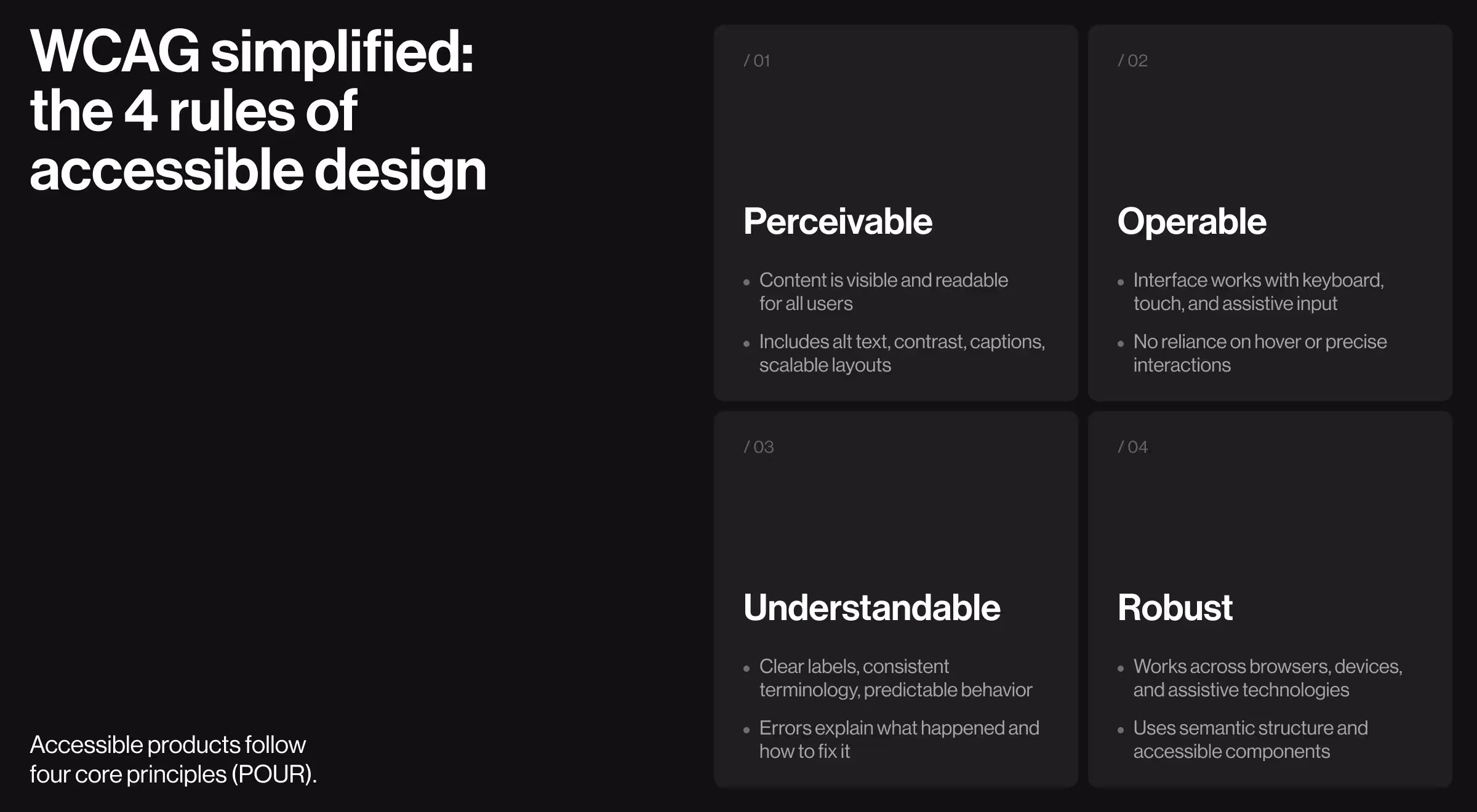
1. Perceivable
Every user must access content through at least one clear channel. Visual-only information excludes screen reader users, and relying on color alone leaves those with color vision deficiencies behind.
Key implications:
- Text alternatives for non-text content (alt text, labels tied to function)
- Sufficient contrast for readability in varied lighting conditions
- Content that adapts to zooming in/out
- Captions or transcripts for audio/video
✅ Implementation tips:
- Typography scale: Ensure minimum font sizes and line heights maintain legibility across breakpoints and zoom states.
- Data visualization patterns: Charts must include labels or annotations so that the meaning doesn’t rely on color alone.
- Media components: Predefine caption support and transcript patterns for all video/audio components.
2. Operable
Interfaces must be usable through different input methods because not every user interacts with a product the same way.
Operability ensures that interaction remains possible even when the user’s input method or physical ability differs from the “default”.
Key implications:
- Full keyboard navigation across all flows
- Visible and consistent focus states
- No reliance on hover-only interactions
- Tap targets sized for real-world use
✅ Implementation tips:
- Define how components work with a keyboard. Every interactive element (buttons, tabs) should have a predictable keyboard combination.
- Support more than one interaction mode. Key actions (e.g., opening menus or submitting forms) should work via keyboard, click, and touch input.
- Standardize tap and click areas. All interactive elements should meet a minimum size (e.g., 44×44px) so users can comfortably interact with them.
- Avoid interaction patterns that require perfect timing or control. Dragging or timed actions should always have simpler alternatives.
3. Understandable
Access and navigation aren’t enough. Users also need to quickly grasp what’s happening and what to do next.
Key implications:
- Clear labels and instructions
- Consistent navigation and terminology
- Error states that explain and guide recovery
- Predictable interaction patterns
✅ Implementation tips:
- Content design rules: Standardized naming conventions for actions (e.g., “Continue” vs “Next” used consistently across flows).
- Form patterns: Defined validation logic (inline errors, real-time feedback, clear recovery paths) to avert disparity in handling errors.
- Feedback components: System-wide patterns for success, error, loading, and empty states with consistent messaging structure.
- Navigation logic: Reusable navigation patterns that behave consistently across sections (menus, breadcrumbs, logical tab order).
4. Robust
Content must remain usable across technologies, especially assistive tools like screen readers.
Key implications:
- Semantic structure that assistive tech can interpret
- Compatibility with screen readers
- Adaptive layouts
- Consistent behavior across environments
✅ Implementation tips:
- Design–dev alignment: Components documented with accessibility expectations (ARIA roles and states) to ensure correct implementation.
- Responsive behavior rules: Layout systems that maintain hierarchy and function across breakpoints and zoom levels.
- State management patterns: Ensure dynamic updates (e.g., modals, alerts) are communicated to assistive technologies.
- Cross-platform validation: Components tested across browsers, devices, and assistive tools as part of system QA.
Examples of accessible UX design solutions
The strongest products don’t assume optimal conditions. They work despite constraints. That’s why accessibility-first UX minimizes dependencies on perfect vision and precise motor control.
Below are practical examples of how accessibility UX shows up in real products and how these decisions boost usability.
1. Visual accessibility
Visual accessibility ensures that everyone can perceive information, no matter their vision or the environment they’re in.
Accessibility features:
- High-contrast UI systems that pass WCAG AA standards
- Text scaling without layout break (up to 200%)
- Semantic structure for screen readers
- Dark/light modes for different lighting environments
💼 Case in point: With the Kin platform redesign, our team addressed a fragmented interface with inconsistent layouts and overloaded screens by introducing:
- Unified layout systems across pages
- Simplified hierarchy to prioritize key actions
- Clear entry points to critical features
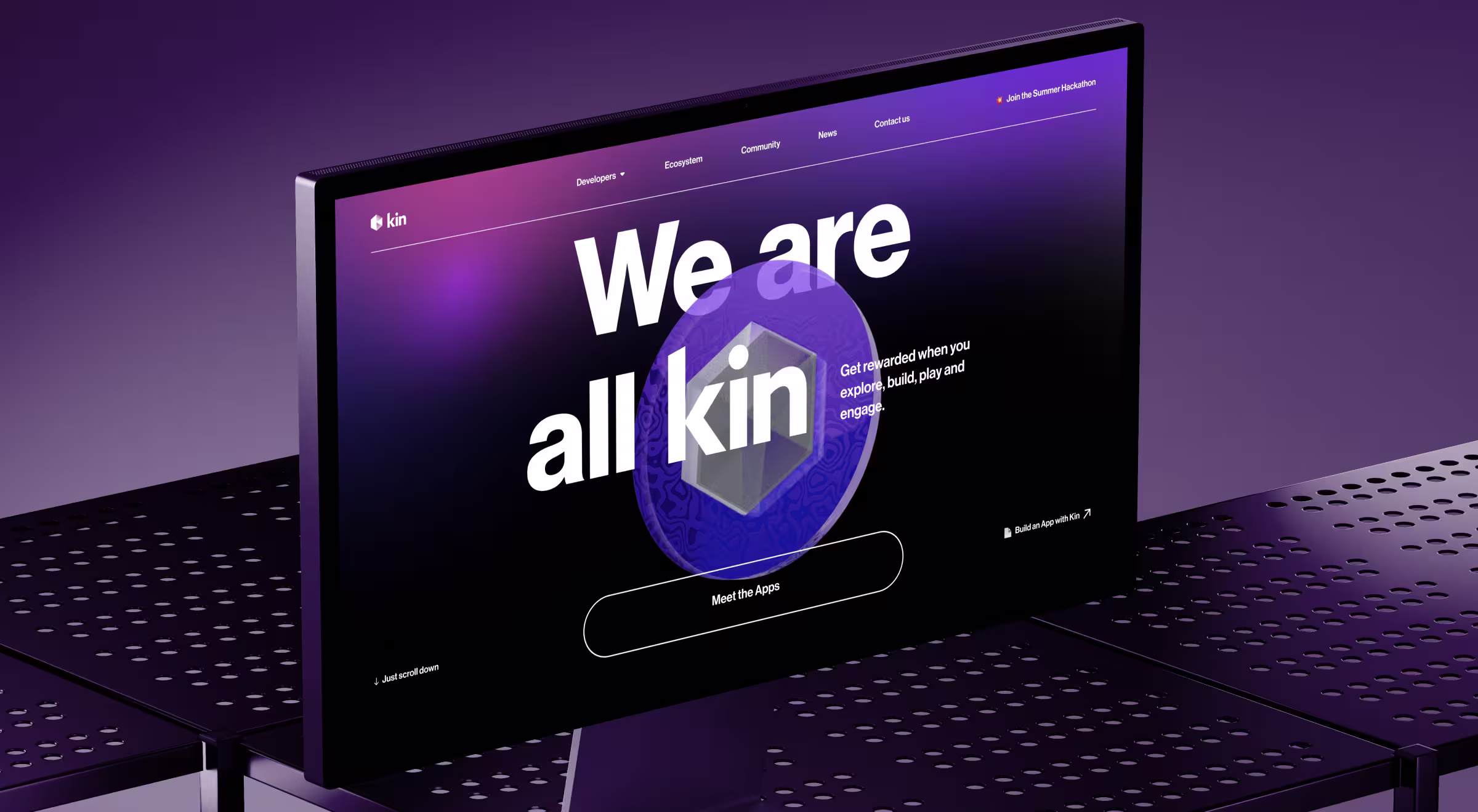
These changes reduced visual noise and improved scanability, allowing users to interpret the interface and act with less effort. When the structure is immediately clear, attention shifts from decoding to doing.
2. Hearing accessibility
Hearing accessibility ensures that content and system feedback are not dependent exclusively on sound.
Accessibility features:
- Closed captions for all video content
- Visual indicators for notifications and alerts
- Alternative communication channels (chat instead of calls)
💼 Case in point: When designing an interface for Accern Rhea, we avoided reliance on implicit or hidden feedback. Instead, the system:
- Surfaces AI responses, suggestions, and clarifications visually
- Uses contextual prompts and hints to guide users
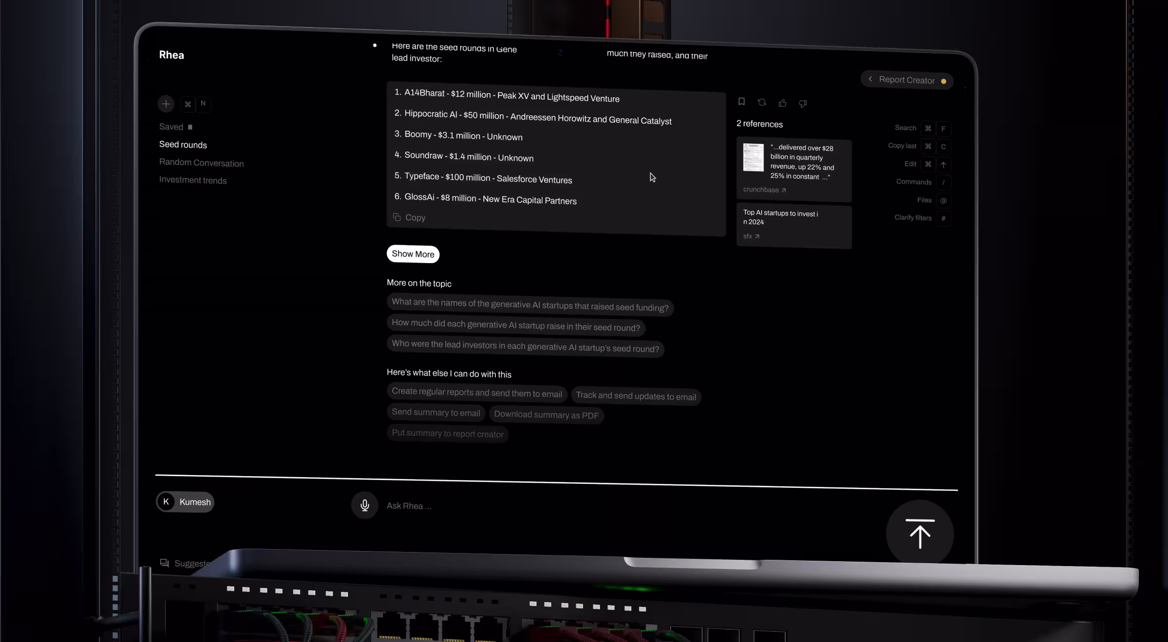
The redesigned interface actively communicates what’s happening and what to do next. The product operates as inherently assistive, so users are never dependent on a single sensory channel to understand it.
3. Motor accessibility
Motor accessibility in UX eliminates the need for precision-driven interaction. It ensures that users (whether they have limited dexterity or use non-traditional input methods) can operate a product effortlessly.
Accessibility features:
- Step-based flows instead of dense forms
- Large, clearly defined interactive elements
- Reduced the need for simultaneous actions
💼 Case in point: In the Riptide e-commerce website project, the original experience overloaded users with dense inputs and intricate decision paths. We redesigned the checkout into:
- Clear, sequential steps
- Focused screens with limited input fields
.avif)
This made the flow accessible even under constrained interaction conditions. That way, users don’t need to “fight” the interface to complete a task.
4. Cognitive accessibility
Cognitive accessibility focuses on how easily users can understand and act within a system. It is often the most overlooked and the most impactful.
Accessibility features:
- Progressive disclosure of information
- Clear, predictable flows
- Contextual guidance instead of static instructions
💼 Case in point: Uber reduces motor effort by structuring its core flow around minimal interaction steps:
- One primary CTA per screen
- Large tap targets for key actions (ride selection, confirmation)
- Autofill for pickup locations and saved destinations
Users can complete the entire booking flow with minimal input and low precision, even on the move. Thus, they spend less time thinking about the interface and more time achieving their goals.
How to reach web accessibility in UX design
“Don’t fall into the trap of perspective taking when developing accessible UX solutions. While helpful at first glance, imagining yourself in someone else’s shoes leaves too much room for bias.
Alternatively, opt for perspective getting — user research. Grounding design hypotheses and assumptions in actual data and user behaviors gives you actionable insights. User feedback reveals where accessibility barriers actually appear and which constraints matter most. That is the difference between designing for accessibility in theory and building experiences that remain usable in practice.”
{{Anna Demianenko}}
At Lazarev.agency, we don’t treat accessibility as a late-stage audit or a compliance patch. Our team approaches it as a structural UX task: remove friction and make core flows work under real-world constraints.
Below is the step-by-step approach we implement for products across industries.
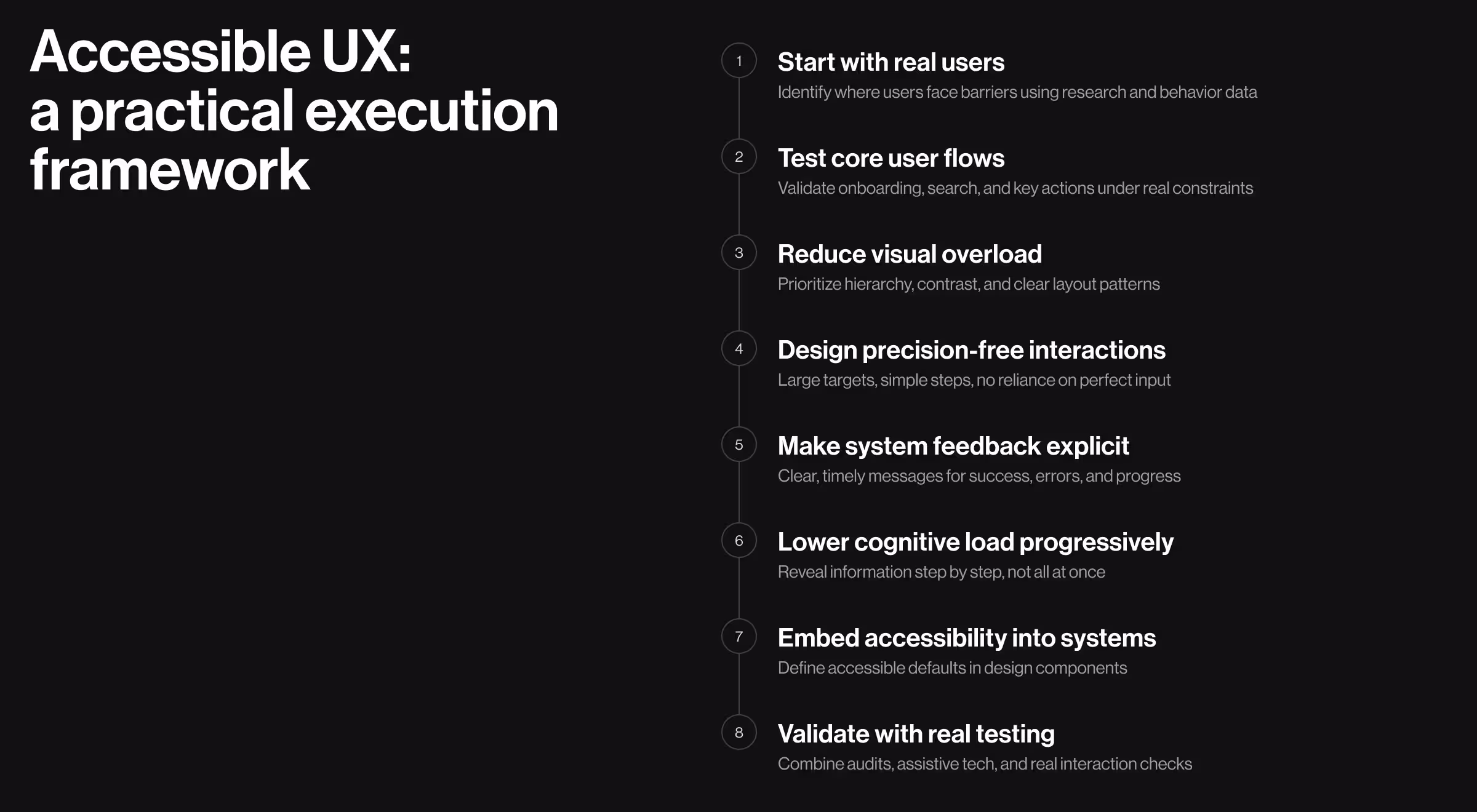
1. Start with users
Before designing a single layout, identify which users are most likely to encounter barriers in your product. That includes not only people with permanent disabilities, but also users operating under temporary or situational constraints: low light, noisy environments, limited mobility, cognitive overload, or device limitations.
This is where perspective getting matters. Use:
- user interviews
- usability testing
- behavioral analytics
- support tickets and complaints
- session recordings and drop-off points
The goal is to uncover where the product becomes hard to perceive, navigate, understand, or operate.
🔍 Learn more about the risks of skipping user research in our dedicated article.
2. Map accessibility risks across core user flows
Accessibility should be evaluated at the flow level. A visually appealing homepage means little if onboarding, search, checkout, or dashboard interaction breaks for part of your audience, which is why strong teams frame their goals for a website redesign around complete journeys.
Map your highest-value journeys and pressure-test them:
- Can users complete the flow without a mouse?
- Can they understand it without sound?
- Does the interface hold up under zoom and text scaling?
- Are instructions and system feedback clear enough for first-time use?
🔍 Building strong core user flows is key here. Explore the fundamentals of dashboard UX design and UI systems that win customer trust.
3. Reduce visual strain before adding more functionality
One of the fastest ways to improve accessibility is to remove what users don’t need. Overloaded digital interfaces make products harder to navigate for everyone, particularly for users with special needs.
Prioritize:
- clear hierarchy
- predictable layout patterns
- distinct grouping of related content
- strong contrast and readable typography
4. Design “precision-free” interactions
Many products become inaccessible because they assume users can interact quickly and precisely. Small hit areas, dense forms, hidden controls, and multi-action screens create unnecessary obstacles.
Instead:
- break complex tasks into smaller steps
- enlarge tap and click targets
- make interactive states obvious
- avoid requiring exact pointer movement or rapid interaction
5. Make system feedback explicit
Accessible UX depends on clear communication between the product and user. People need to know what changed, what is happening, what failed, and what to do next. When feedback is subtle, delayed, or hidden, many users get lost.
Design feedback so it is:
- visible
- specific
- timely
- tied to the relevant action or field
🔍 Making system feedback explicit is particularly important for AI-first digital products. Explore the actionable insights from our Design Lead to find out how to design AI products users understand.
6. Use progressive disclosure to lower cognitive load
Accessibility is not only about sensory or motor needs. Many products ultimately get dismissed because they demand too much too early. Dense screens and too many choices create cognitive weight that slows everyone down.
Use progressive disclosure to reveal information as it becomes relevant. That means:
- one primary action per step when possible
- concise labels and instructions
- supporting details shown contextually
7. Build accessibility into components and systems
Web accessibility should not depend on whether one designer remembered a checklist. It needs to be embedded into the design system itself.
That means defining accessible defaults for:
- typography scale
- contrast ratios
- buttons and input states
- focus and error states
- form patterns
- navigation components
- content spacing and hierarchy
🔍 When accessibility lives inside reusable components, consistency improves. And it all starts with building a solid design system. If you’re unsure where to start, our Design System 101 guide offers valuable insights to help you see why a strong design system matters.
8. Validate with testing
No team can assess accessibility by eye. What looks usable in design files often breaks in interactions, especially those with assistive tech.
To properly evaluate accessibility, combine automated audits, assistive tech testing, and interaction checks.
Here’s our recommended list of accessibility testing tools and best ways to use them.
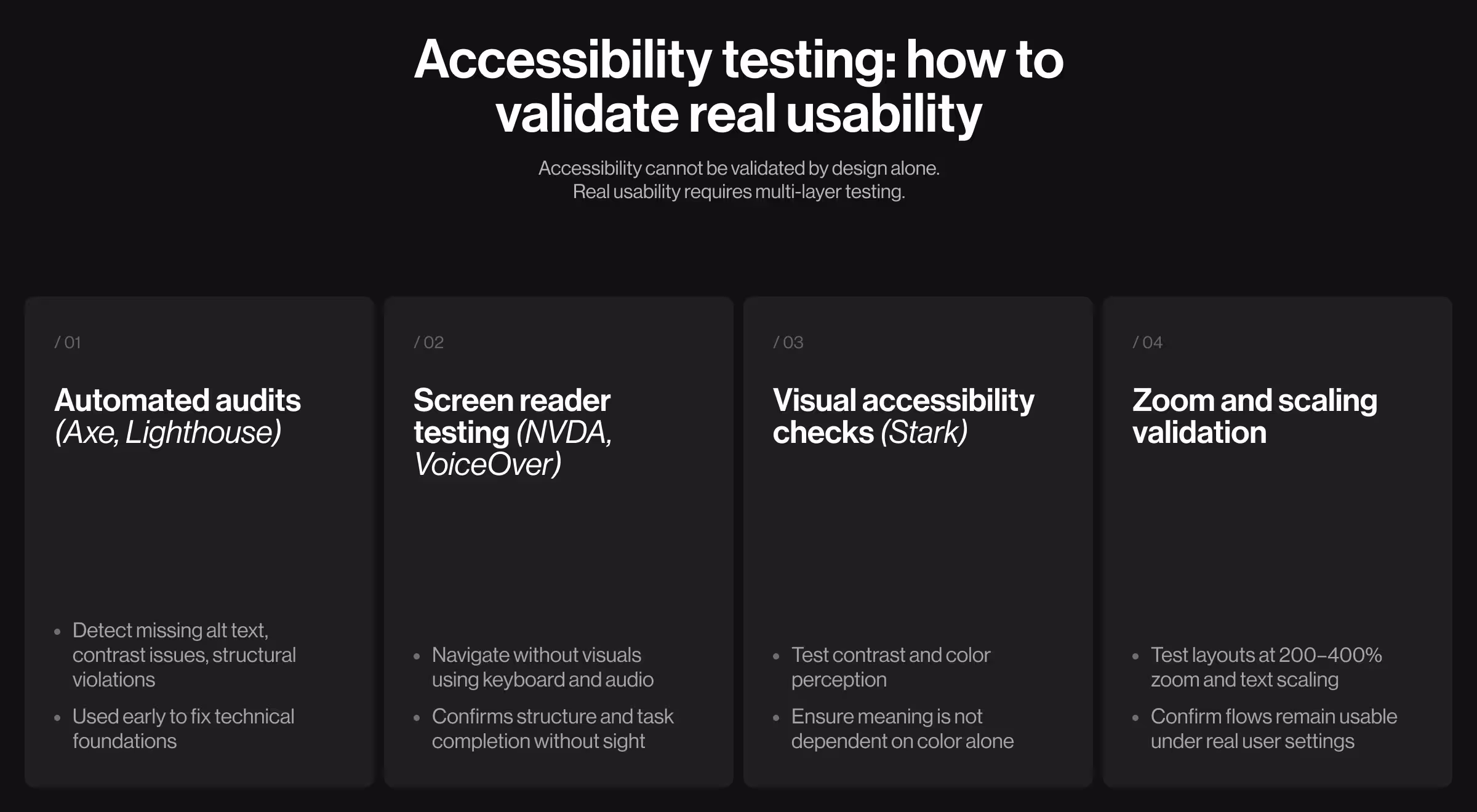
1. Automated audits for fast issue detection
Your team can use these tools directly on your live product (or staging environment) to detect any violations in terms of technical accessibility.
- Axe DevTools: run the extension on any page to detect WCAG issues like missing alt text or insufficient contrast.
- Google Lighthouse: generate an accessibility report in Chrome DevTools. Use the score to identify weak areas, then follow the recommendations for improvement.
✍️ How teams use this: Run audits at the testing stage to spot violations early on. These tools help clean up the structural foundation for your digital product.
2. Screen reader testing
Use screen readers to understand how your product is experienced without visual context.
- NVDA (Windows) or VoiceOver (macOS/iOS): navigate your product using only the keyboard while the screen reader is active.
✍️ How teams use this: Simulate a non-visual experience. If users cannot understand the structure or complete tasks solely through audio, your UX lacks accessibility.
3. Visual accessibility testing
Check whether the content is readable under different visual conditions.
- Stark (Figma plugin): test color contrast directly in designs and ensure text meets WCAG standards.
- Use the color blindness simulation to verify that meaning is not conveyed by color alone.
✍️ How teams use this: Validate design decisions before development and ensure visual clarity holds across different perception conditions.
4. Zoom and scaling tests
Test how your interface behaves when users increase text size or zoom.
- Use browser zoom (200–400%) to check layout behavior
- Adjust OS-level text scaling to simulate user settings
✍️ How teams use this: Run full user flows under zoom. If users cannot complete tasks at higher zoom levels, the layout is not resilient.
Design for accessibility: build products that work for every user
For leadership teams, accessibility work is not separate from performance. It improves completion rates, reduces drop-offs, expands reach, and strengthens trust.
At Lazarev.agency, a digital product design agency, we design accessibility as part of product strategy to ensure every interaction works under real conditions.
If your product needs to scale across users, markets, and contexts, reach out for a personalized consultation on how to integrate accessibility UX design directly into your product.


.webp)


.avif)