

App stores don’t rank promises or feature lists. They rank what users do after installation. How long they stay, how often they return, whether they recommend the app, and how quickly they abandon it. UX is right at the center of every one of those signals.
If your app ranking has come to a halt despite ongoing app store optimization (ASO), user experience is likely the issue. In this article, we explore how UX shapes app store ranking and what to adjust when your goal is to improve the app’s visibility for sustainable growth.
Key takeaways
- ASO attracts attention, while UX sustains ranking. Search optimization gets users in. Experience determines whether they stay.
- Retention forms faster than most teams realize. Day-one behavior shapes how app stores assess the relevance of your app product.
- Ranking improves when UX confirms search intent. When what users find matches what they experience, engagement and reviews reinforce visibility naturally.
App store optimization done right: 4 key app store ranking factors
Before users experience your app, they have to find it. For most, that happens inside the app store search bar.
App stores are much like intent-driven marketplaces. Users arrive with a problem in mind, type a query, scan results quickly, and make snap decisions based on how relevant search results seem to be.
ASO controls that moment of discovery. When ASO is weak, even strong products remain invisible. When it’s misaligned, apps attract the wrong audience and struggle to hold ranking later.
With ASO, the goal is to be found for the right reasons by the right users. Below are 4 app store ranking factors worth optimizing to ensure people searching for an application like yours will see it.
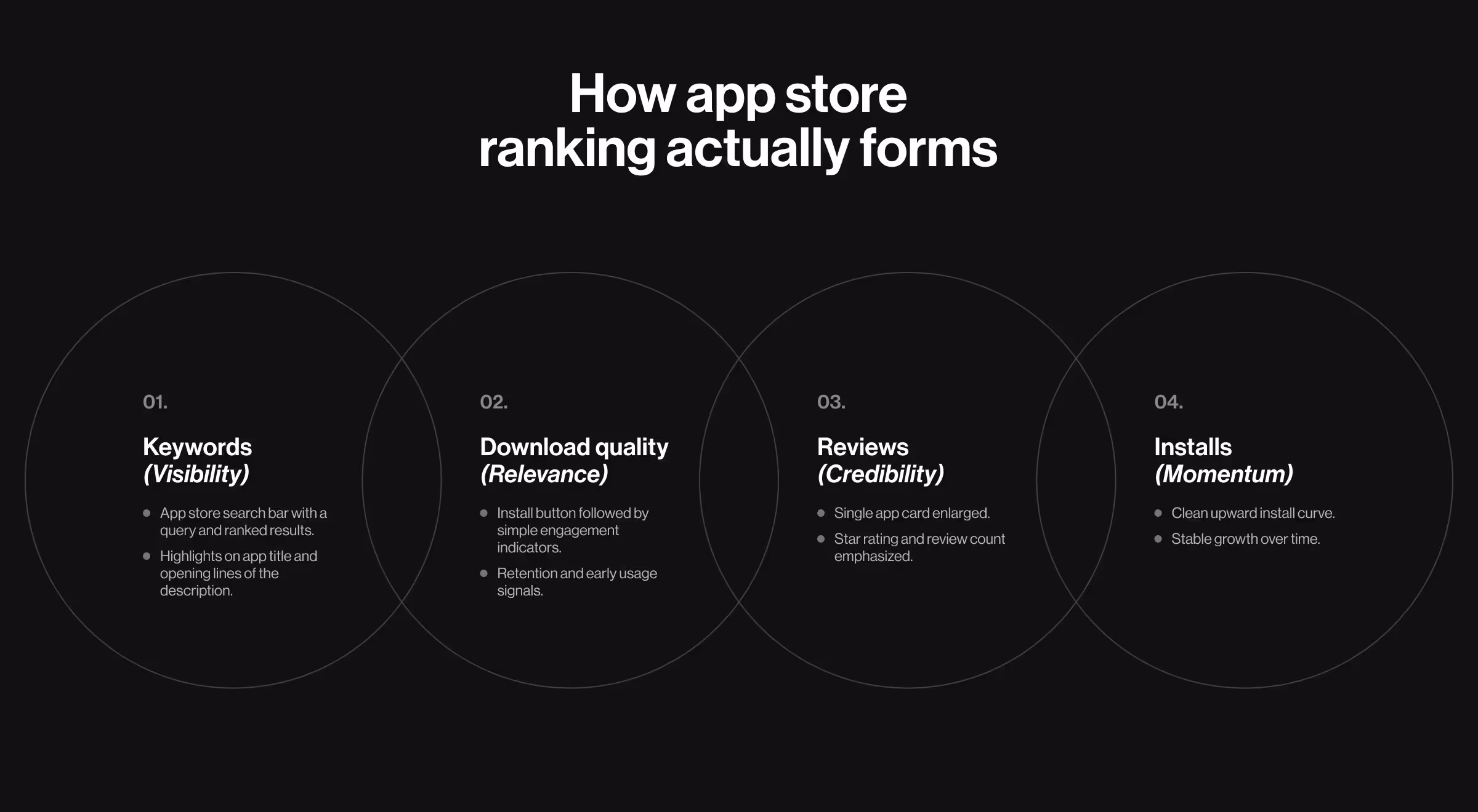
1. App store keyword optimization (app title and app description)
Users search with intent. Your app title and app description determine whether your product gains more visibility for potential users and whether it looks relevant enough to tap.
✅ What matters here:
- Keywords in the title reflect how users describe the problem.
- App descriptions optimized for scanning.
- Clear articulation of the app’s core value proposition within the first lines.
A strong keyword strategy aligns your app with real search demand and filters out low-intent traffic.
2. App download quality
App stores evaluate what happens after users discover and install an app. If search-driven installs consistently disengage, ranking eventually slows down regardless of keyword relevance.
✅ From an ASO perspective, download quality signals:
- Whether your app store listing attracts the right audience.
- Whether search intent matches product intent.
- Whether installs are reinforcing or weakening relevance.
High-quality installs validate that your app deserves its search position.
3. Positive social proof through reviews
When users scan search results, positive ratings and reviews influence whether your app grabs attention. App stores also interpret consistent positive sentiment as a sign of reliability and relevance.
✅ Reviews serve two roles:
- Increase tap-through from app store search results.
- Reinforce trust in competitive keyword spaces.
Search visibility rises faster when social proof confirms expectation.
4. Number of installs
A rising install count indicates that your app is being discovered and selected for relevant searches.
✅ From a search standpoint:
- Install velocity validates keyword relevance.
- Sustained installs signal continued demand.
- Sudden spikes without follow-through fade quickly.
ASO gets users to the door. What happens next determines how long the door stays open.
Taking app optimization one step further: how strategic UX grants better app rankings?
ASO can win attention. It cannot compensate for disappointment. No optimization survives a poor experience.
Positive reviews signal a product that exceeds expectations. When an app feels intuitive and thoughtful, users reward it by sharing enthusiastic feedback.
That’s why app ranking starts inside the product. Before refining titles and descriptions, examine UX as a system using the strategies below.

1. Optimize onboarding to prevent early exits
If the first session fails to confirm relevance, users disengage before ranking signals even form. No keyword strategy survives confusion in minute one.
Think of effective onboarding as a short path to organic growth: one clear outcome, immediate action, and contextual support.
Practical insight: For Activote, extended onboarding hindered retention. Users were spending up to 15 minutes in the app, yet didn’t return (due to a lengthy introduction with no value proposition).
We applied a phased redesign approach to shorten the path to first value. Non-essential steps were removed and training content was made concise and non-intrusive. Our team redesigned onboarding flow as a relevance-reinforcing entry point to accelerate engagement and improve retention.

Practical implementation cues:
- Strip the first session down: remove any input that does not guide users to a clear value proposition.
- Delay commitment: ask to create an account or share profile data only when these details enable progress.
- Make the next step unavoidable: the primary action should be visually dominant on the first screen.
- Show progress: lightweight checklists and progress cues outperform static tutorials.
Teams that redesign onboarding this way consistently reduce early drop-off and stabilize day-one retention — two signals app stores weigh heavily when adjusting rankings.
🔍 Dig deeper into how to design successful new customer onboarding with our expert playbook.
2. Ensure high-speed performance to preserve trust
When screens lag or feedback arrives late, user confidence drops. Most users won’t explain this in reviews. They just disengage or leave a low rating.
Data insight: According to Google, as page load time increases from one second to ten, the probability of a mobile user bouncing rises by 123%. That behavior feeds directly into app store ranking signals.
Strategic UX treats speed as part of the interface. The user should always feel the app is responding or preparing the next step.
UX levers to protect perceived speed:
- Responsive feedback: Immediate visual response to every tap, even if processing continues in the background.
- Early-path restraint: Remove visible system checks or validations from the first session.
- Critical-path priority: Optimize speed where users spend most of their time, instead of focusing on use cases that few users encounter.
Implementation insights:
- First interaction responds in under one second (visually if not technically)
- Loading states explain progress instead of exposing delays
- Background processes are deferred until after first value is delivered
- Performance issues never block the primary action flow
🔍 Explore our dedicated guides on bounce rate optimization and customer churn rate reduction to strengthen this performance-to-retention link.
3. Personalize the experience through anticipatory design
Anticipatory design improves ranking signals by making the product easier to use. Users don’t have to set preferences or configure anything. The interface adjusts based on context and behavior.
Data insight: Google reports that 58% of smartphone users feel more favorable toward mobile apps that remember who they are and what their past behavior was. Similarly, Google states that 63% are more likely to purchase when recommendations are relevant.
What effective anticipatory design looks like:
- Intelligent defaults: The first layout reflects the most likely user intent based on entry point or early behavior.
- Behavior-driven evolution: Interfaces adapt as behavioral patterns form.
- Deferred choice: Personalization happens after value is delivered.
Anticipatory design patterns that hold:
- Default dashboards reflect the primary job that users came to do
- Repeated actions surface faster over time without user setup
- Recommendations are contextual
- Personalization signals are subtle, never announced
- Users can override changes without resetting the entire system
🔍 Customizable dashboards and adaptive layouts, key UI trends for 2026, drive user engagement because they feel like that personalized foresight.
4. Design conversational UI
Users abandon apps when completing an action takes too long or requires excessive navigation. A well-designed conversational interface collapses multi-step flows into a single interaction.
The strongest ranking impact comes from a small set of high-leverage use cases:
- Intent compression: Replace multi-screen flows with a single conversational input.
- Context carryover: Maintain state across sessions so users resume instead of restarting.
- Task decomposition: Break complex actions into short, guided steps inside the same interface.
Together, these patterns reduce hesitation and shorten time-to-completion — behavioral signals app stores interpret as relevance.
To sustain engagement, conversational UI relies on several interaction patterns:
- Anticipatory prompts triggered at natural decision points
- Multi-turn reasoning to handle complex requests without dead ends
- Rich visual grounding through previews and progress indicators
- Smart fallbacks that reframe intent instead of returning errors
🔍 For a deeper breakdown of how conversational interfaces accelerate real product workflows, see our guide on conversational UI design.
5. Gather user feedback to improve retention
High-value feedback starts with behavior. If users pause, repeat actions, or, all of a sudden, exit, chances are your product’s interface left them confused.
Behavioral signals to monitor:
- Drop-offs mid-flow rather than at entry points
- Repeated taps or back-and-forth navigation
- Delays before primary actions
- Feature abandonment after first use
When explicit input is needed, keep it brief and situational, like in the following micro-feedback moments:
- After task completion or failure
- Following a skipped or reversed action
- At the second or third repeat of a flow
🔍 If you’re refining how feedback flows into design decisions, this article on user feedback strategies expands on the patterns that sustain retention.
Ranking is a reflection of experience
App stores surface products users return to and recommend. You earn that top ranking by making the product easier to adopt and harder to abandon.
In other words, it all boils down to treating UX as a ranking system in its own right. For teams looking to sharpen these signals without internal trial-and-error cycles, outsourcing product design is the most direct move. Teams like Lazarev.agency step in where best-in-class app design turns experience decisions into ranking signals.
Curious what that looks like in practice? Reach out for individual consultation.


.webp)


.avif)


