

AI dashboards differ from traditional analytics dashboards. Conventional ones simply summarize past events. AI dashboards expose the reasoning and behavior of an autonomous system that’s actively making decisions.
For enterprise product teams building AI-first software, the dashboard is the front UI layer where users encounter machine intelligence. As such, the dashboard is the first stepping stone toward an AI-native product experience.
Getting that first step right defines product success. Yet, the task is complex. The so-called invisibility paradox, lack of transparency, confusing navigation, and insufficient human oversight are just a few of the hindrances on the way to making AI value tangible.
In this article, our AI design team explains why traditional dashboards struggle in AI environments, what signals AI dashboards must surface to make AI understandable, and the design patterns we use across real products to turn invisible model behavior into trustworthy UI.
Key takeaways
- AI dashboards must reveal reasoning. AI systems produce probabilistic decisions. Without exposing reasoning signals, dashboards hide the logic behind those outcomes.
- Visibility drives trust in AI products. Users trust AI only when they can evaluate decision trails and system limitations.
- AI dashboards bridge models and product value. The dashboard translates invisible model behavior into signals that show how AI improves workflows and supports decisions.
The AI dashboard challenge: why standard dashboards fail
Many organizations approach AI dashboards with patterns inherited from business analytics tools. That’s a strategic misstep.
According to McKinsey’s report, AI adoption has expanded significantly across organizations. Almost 90% of companies now report using AI in at least one business function. Still, most initiatives are in pilot stages with little enterprise-wide deployment.
This means companies are figuring out how to operationalize AI inside their products and workflows. In other words, organizations are building AI capabilities faster than they are designing interfaces capable of communicating those capabilities.
The result is what we call the visibility–trust contradiction:
- Too much information overwhelms users.
- Too little information makes AI decisions feel opaque and unreliable.
Designing an AI dashboard means resolving this tension. But the first step is recognizing that traditional dashboard approaches were never built for AI systems.
They were designed for retrospective analytics, not for explaining how autonomous systems reason and adapt.
🔍 Have a closer look at the specific UX principles for building better AI products.
For starters, consider the most common reasons traditional dashboard design approaches fail when applied to AI products:
- They visualize outcomes and leave reasoning concealed. Standard dashboards focus on KPIs and outputs, while AI systems require visibility into how a decision was reached.
- They assume static data flows. AI systems operate continuously and adapt dynamically — they’re conceptually flexible. Fixed metric views are insufficient.
- They ignore uncertainty. Machine learning produces probabilistic outputs. Traditional dashboards assume binary results.
- They separate analytics from action. AI dashboards must connect insight directly to operational workflows and decisions.
- They focus on retrospective reporting. AI products often require real-time monitoring and interaction with ongoing model behavior.
- They hide system limitations. Users lose trust when dashboards omit communicating uncertainty or model boundaries.
- They fail to visualize the AI learning curve. Machine intelligence evolves. Static dashboards cannot communicate model improvement or drift.
What an AI dashboard should show
AI systems operate beneath the surface of the product experience. Users interact with outputs, but the underlying reasoning and decision-making processes stay behind the scenes. The dashboard's role is to bridge these two facets, which is the central challenge in learning to design AI products users understand.
“AI companies face a paradox that traditional software never had to solve. The technology works, but it works invisibly. When a chip like Apple’s M-series accelerates a laptop, the value is obvious through improved performance. AI systems operate differently. They influence decisions and workflows in ways that are harder to observe.
This creates a serious product challenge. Executives invest heavily in AI, yet struggle to show stakeholders where the value actually materializes. We’ve seen this across enterprise clients: the models perform well, but the product fails to communicate what the AI is doing and why it matters. When the system’s reasoning remains hidden, success becomes difficult to measure and even harder to defend. That’s where AI dashboard design becomes strategic.”
{{Kirill Lazarev}}
Below are the core elements behind a functional AI dashboard.
Design patterns for AI visibility
After working on 30+ AI-first digital products, our design team has repeatedly observed the same UX patterns across the most successful AI interfaces. These patterns are structural solutions to a deeper challenge of making algorithmic reasoning understandable to humans.
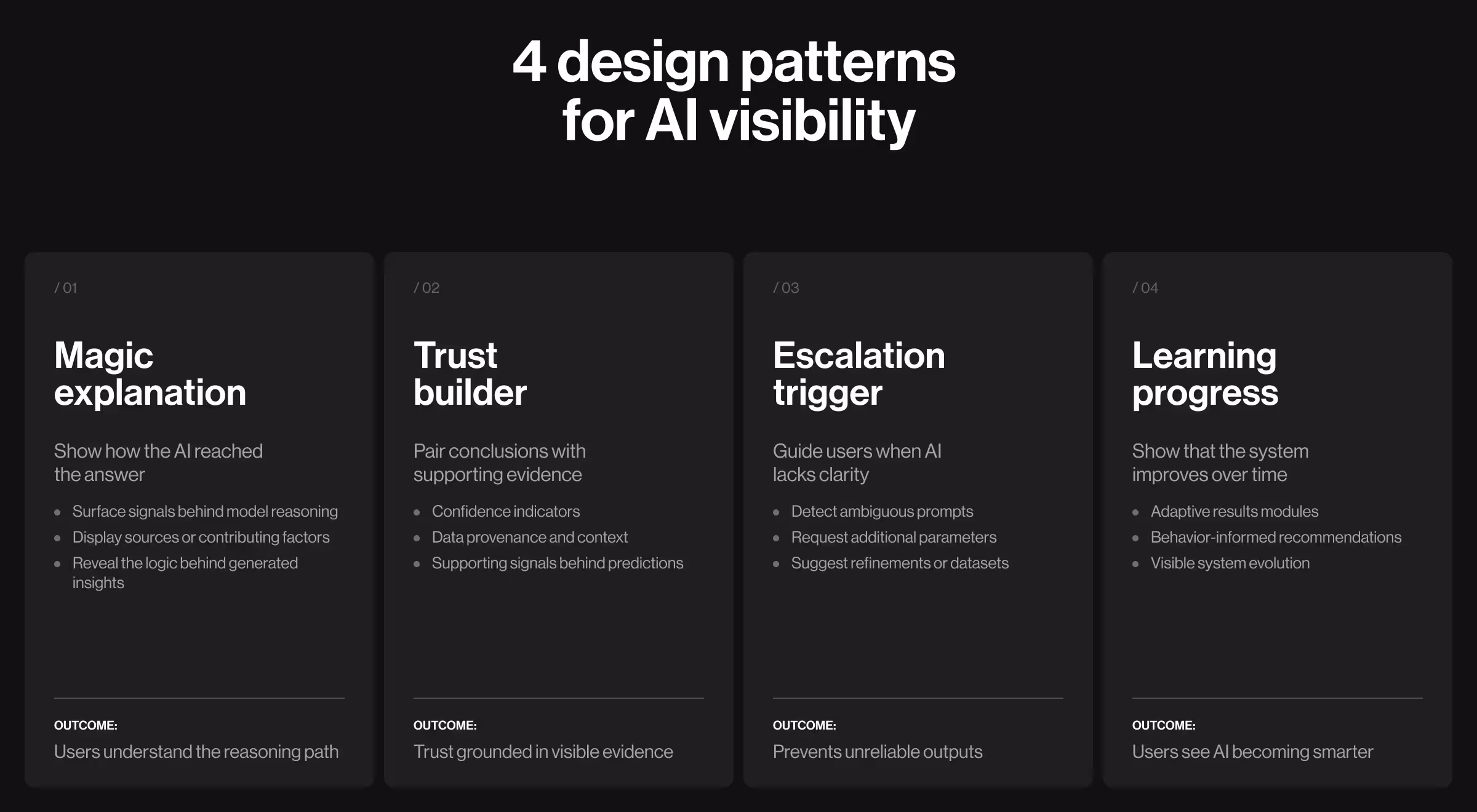
1. The "magic explanation" pattern
Design principle: show the reasoning behind AI decisions.
AI outputs without explanation appear arbitrary. Users receive an answer but can’t determine whether the system understood the problem.
The “magic explanation” pattern addresses this by exposing the reasoning path behind AI-generated insights. The interface surfaces the signals that shaped the model’s conclusion.
💻 Practical example: In VTnews.ai, the AI analyzes over 130k news sources in real time and compiles coverage into unified stories. The interface goes beyond a single synthesized summary and reveals how different media outlets frame the same event.
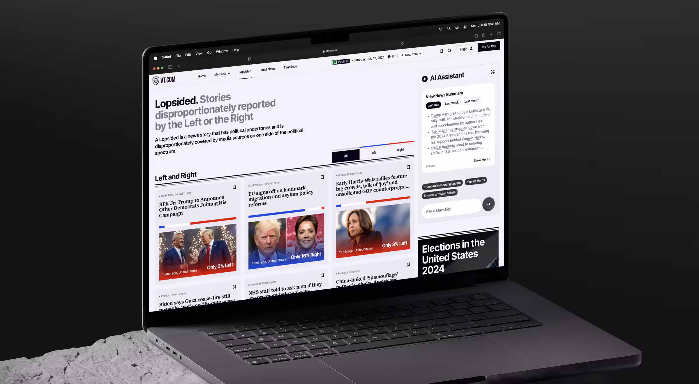
Each story includes a structured breakdown showing:
- summaries generated by the AI model
- perspective labels from left-, center-, and right-leaning outlets
- a bias distribution bar indicating how different political positions cover the event
This structure lets users trace the reasoning signals behind the system’s conclusions. The dashboard reveals the inputs the model used to interpret how the event is covered across media.
2. The "trust builder" pattern
Design principle: display confidence and rationale together.
A probability score without context leaves users guessing whether the model gets the underlying problem. Trust emerges when the system reveals the signals supporting its conclusions.
💻 Practical example: In the CollectorCrypt platform, the primary challenge was trust in the authenticity and value of collectible assets. High-value trading requires visibility into provenance and market behavior.
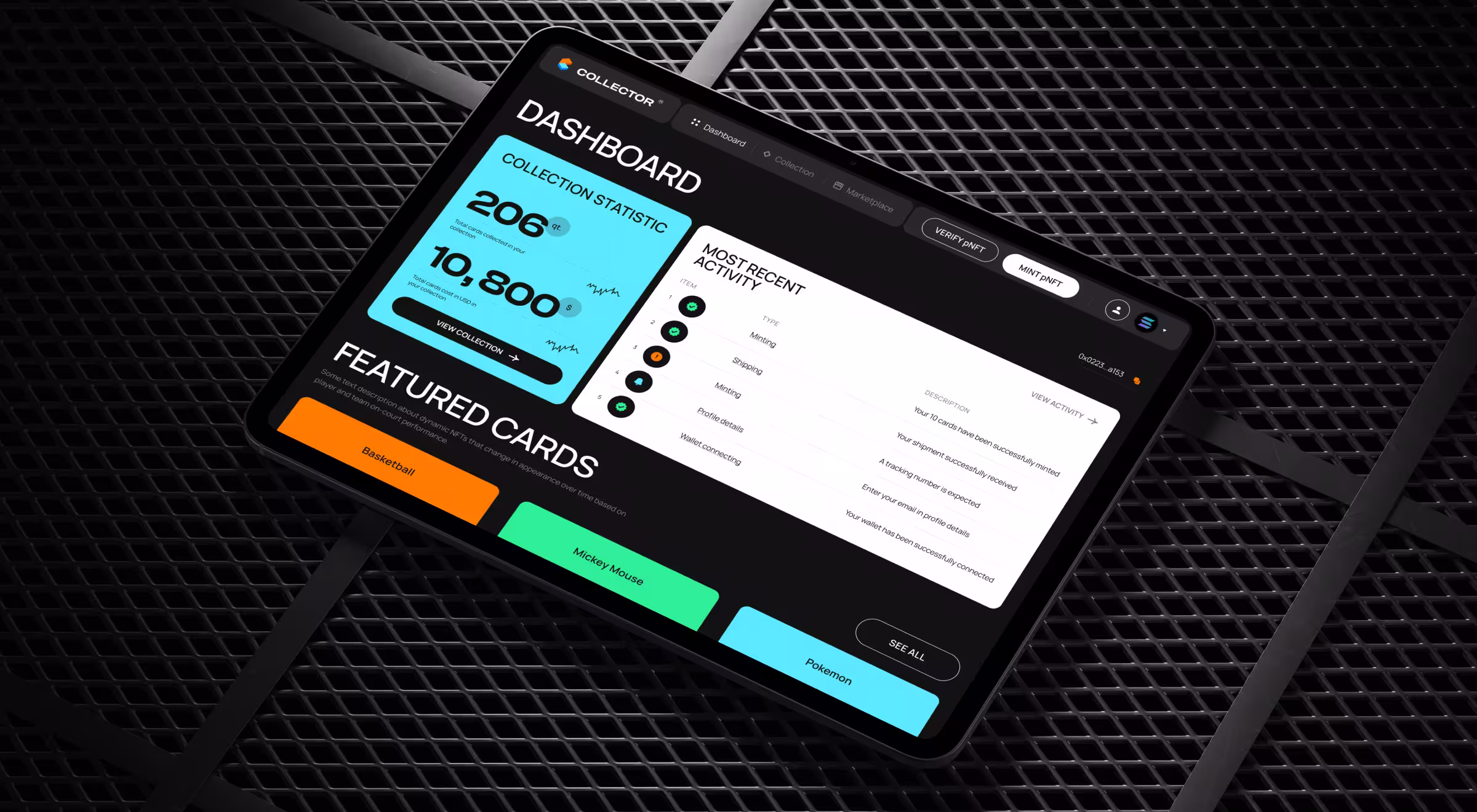
To address this, our team designed a data-rich asset page for every collectible card to function as a transparent digital passport.
Each card interface presents:
- authentication confirmation tied to blockchain-backed pNFT records
- verified ownership history and transaction timelines
- price dynamics reflecting market demand and historical valuation
- metadata about grading and storage verification
These elements appear within a clear information hierarchy. Collectors do not see a valuation signal alone. They see the evidence that explains it.
🔍 Explore our field guide on how to create a crypto dashboard design that users love and trust.
3. The "escalation trigger" pattern
Design principle: clarify when AI needs human input or decides not to proceed.
AI systems inevitably encounter ambiguous or incomplete information. When this happens, the interface should guide users toward clarification and better inputs.
💻 Practical example: In Accern’s Rhea research platform, financial analysts work with an AI system that analyzes large financial datasets and generates structured reports. The product combines conversational AI with dynamic widgets and analytical tools.

Early testing revealed a recurring challenge: analysts frequently submitted queries that lacked the specificity required for accurate analysis. So our design team focused on that pattern first.
When Rhea detects ambiguity, the depth of interaction grows more substantial by:
- requesting additional datasets or parameters
- suggesting related metrics or financial indicators
- prompting the analyst to narrow the research scope
This escalation mechanism prevents the system from producing unreliable outputs and helps users form more precise questions.
4. The "learning progress" pattern
Design principle: visualize model improvement over time.
Users are more likely to trust AI when they can observe evidence that the system improves. The learning progress pattern visualizes how the model evolves through continuous feedback and interaction.
💻 Practical example: In Pika AI, Lazarev.agency designed a next-generation search experience to combine conversational AI with a dynamic results interface. The platform curates premium sources and surfaces the most relevant information widgets in response to user queries.
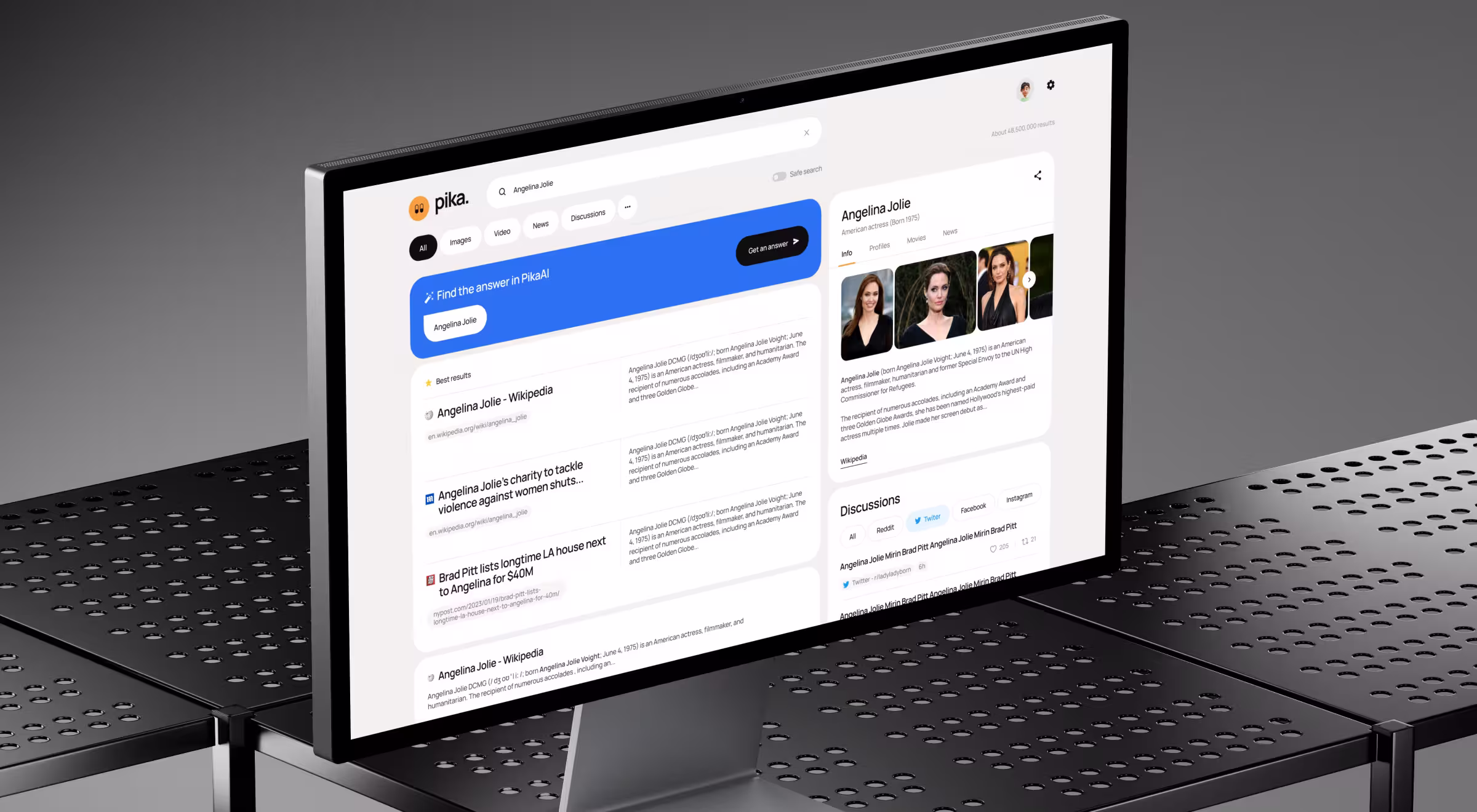
As users interact with the platform:
- AI learns which information modules are most useful for specific queries
- widgets displaying summaries, references, or contextual information adjust dynamically
The interface communicates this progression through adaptive results modules and responsive query refinement.
Over time, users begin to notice that the system delivers more relevant insights. The dashboard reflects not only the current output, but also the growing intelligence behind it.
🔍 For a deeper breakdown of the structural principles behind these interfaces, explore our Lead Designer’s guide on the 5 key principles of AI dashboard design.
Make AI value visible with the right partner
AI systems generate immense value. Yet much of that value remains invisible without the right interface.
Dashboards are where machine intelligence becomes understandable. They translate algorithmic behavior into signals that users can interpret and act upon. The companies that succeed with AI treat this interface as the un-automated layer where AI products earn adoption, designing clearer ways to reveal how those models work.
For teams exploring how to design that layer effectively, conversations with specialists in AI-first product design provide an insightful starting point. Reach out to Lazarev.agency AI product design team for that exact kind of conversation.


.webp)


.avif)

