
Good UI design gets dismissed as "making things pretty," and it is totally wrong.
Interface quality determines whether users complete purchases, trust your platform with sensitive data, or abandon your app after one session.
We've designed interfaces for 30+ AI products, crypto exchanges handling millions in transactions, fintech apps managing cross-border payments.
The same pattern emerges: companies invest in strong backend technology, assume users will figure out complex interfaces, and watch adoption crater. Then they hire us to fix what engineering alone couldn't solve.
In this article, we have gathered top UI design examples from our work showing what moves business metrics.
Key takeaways
- UI complexity is a revenue leak. Every unnecessary step between intent and action costs you conversions. The most profitable interfaces remove decisions.
- Trust is designed. Users don't read your "bank-level security" copy. They feel trust through fee transparency, clear confirmations, and interfaces that behave predictably.
- Your backend is invisible, your interface is the product. Superior technology loses to inferior technology with better UI constantly. Users cannot experience what they cannot navigate.
- Bad design in high-stakes industries is a liability. A $700,000 Uniswap loss from misread slippage settings. A Bored Ape sold for $3,000 instead of $300,000. These are design failures with real financial consequences, and no apology or patch can fully undo them.
AI platforms: your UI determines market survival
Every AI platform right now is fighting for the same users. Most are losing them on the interface.
ChatGPT may have been first, but only 5% of its weekly users pay, highlighting a great opportunity for products that get the experience right.
With 42% of companies abandoning most AI initiatives, surviving products will be ones users want to revisit, and we know how to create such experiences.
Pika AI
Take Pika AI, for example. They launched AI-powered search in 2023 before Google introduced AI Overviews. But their mobile interface couldn't match desktop experience quality. Users tried the mobile version once, and went back to Google. If your mobile UI frustrates, users won't give you a second chance.
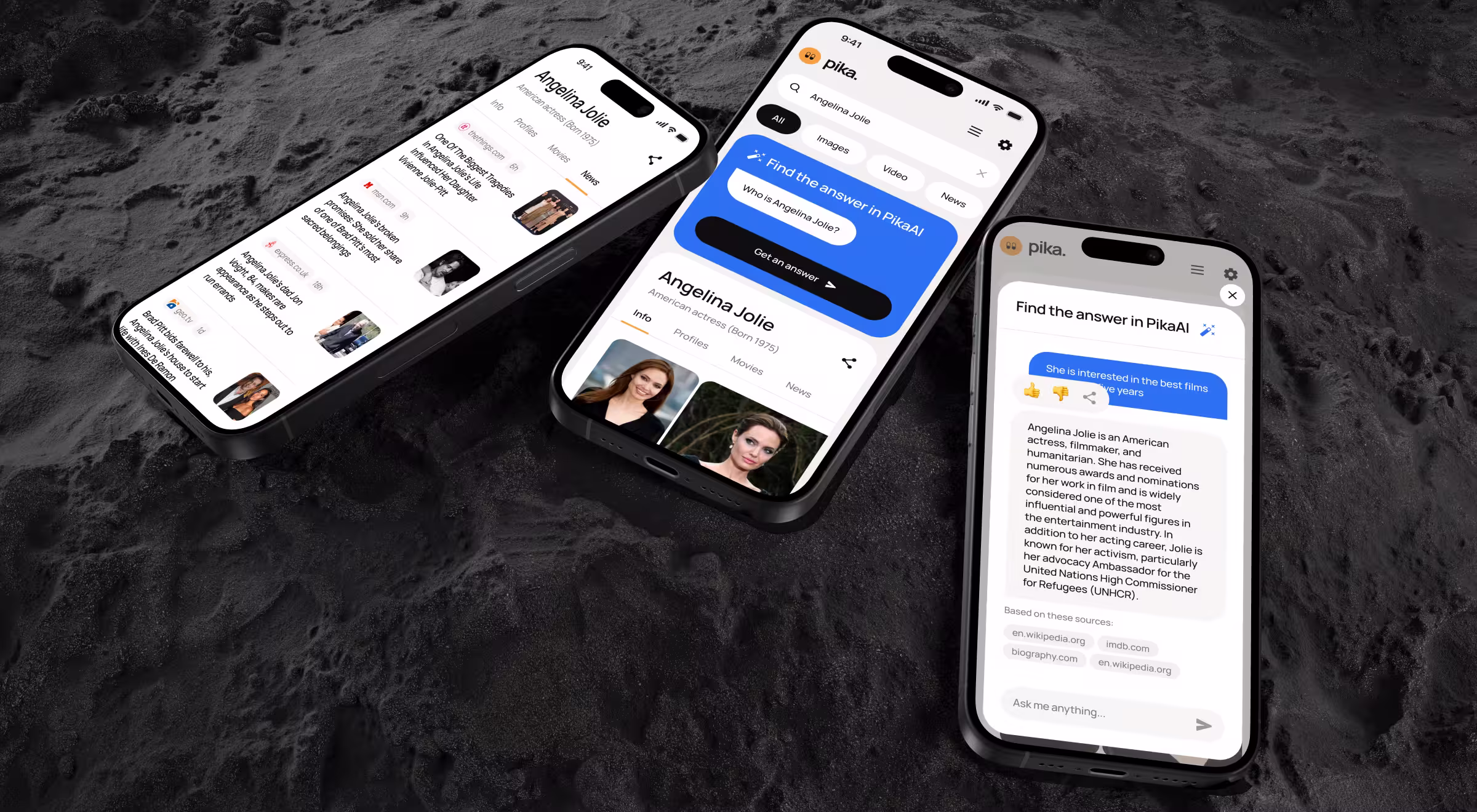
What we did:
- Rebuilt mobile experience matching desktop quality.
- Optimized information density for small screens without losing functionality.
- Minimized actions required to find answers.
- Built multiple search entry points because our testing proved AI search needs more discovery paths than traditional keyword search.
"Mobile optimization is about rethinking workflows for thumb-zone interaction and distracted usage context. Most teams treat mobile as an afterthought. Then wonder why adoption tanks."
{{Oleksandr Koshytskyi}}
🔎 See how we pushed Pika AI further, explore the full breakdown on Dribbble.
Rhea. Accern
Rhea is Accern's AI-powered research tool built for financial analysts, VC investors, and ESG specialists.
Rhea's underlying AI model was sophisticated, precise, and purpose-built for high-stakes financial decisions. It lacked an interface reflecting its sophistication: complex workflows stayed hidden, outputs felt raw, and no elements guided users toward confident action.
Trust is everything in finance. When an interface obscures intelligence, even the most powerful algorithm stalls decisions instead of driving them. Professionals don't act on data they can't read.
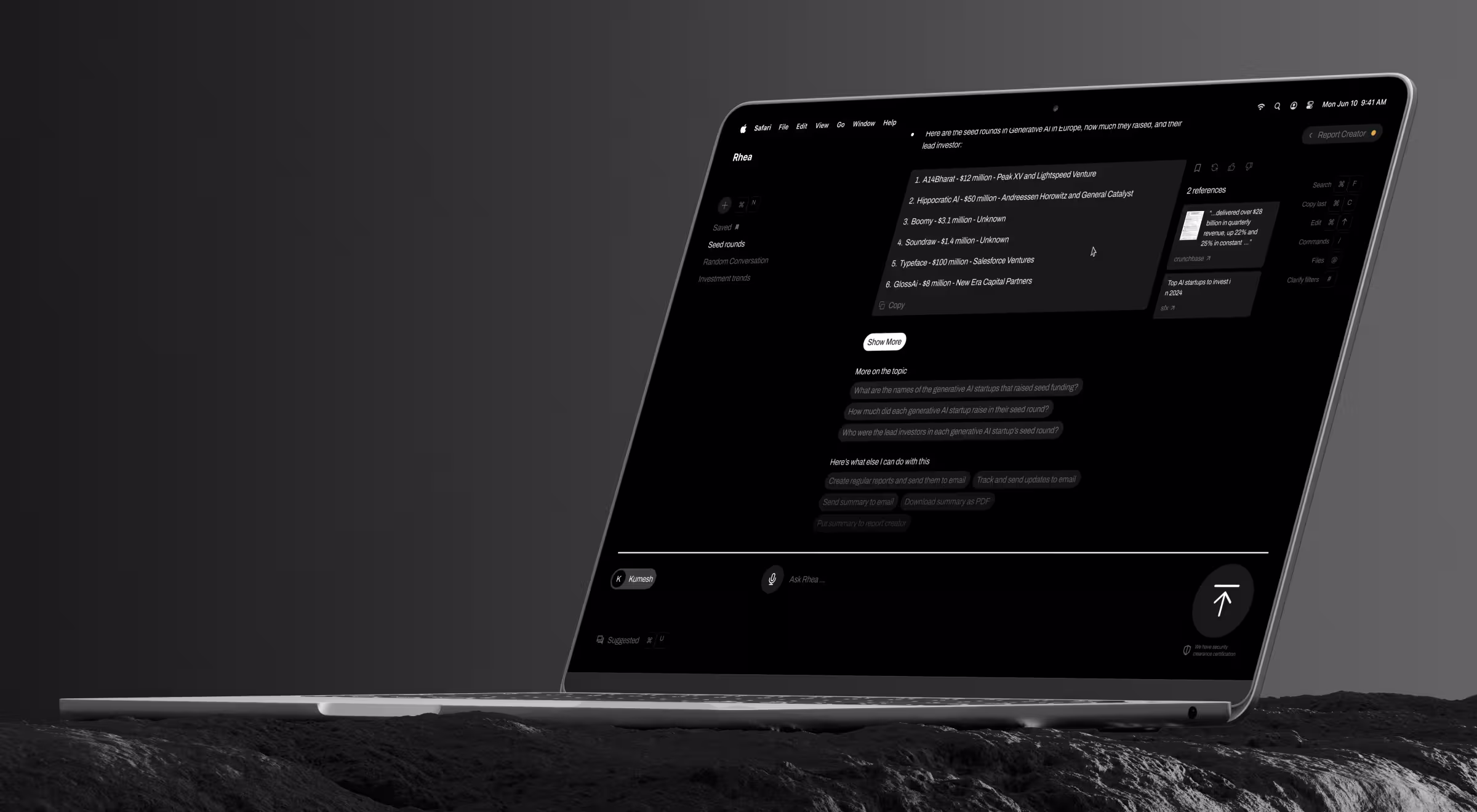
What we did:
- A hybrid GUI and prompt interface was designed, combining conversational AI with dynamic widgets, charts, and interactive elements. Text-only outputs simply weren't enough for how analysts work.
- At the core sat an adaptive natural language system, which meets users where they are. When queries are unclear, Rhea steps in with hints, suggestions, and clarifying questions, helping users reach accurate answers.
- The standard prompt field was rebuilt as a multi-purpose command line to handle file search, automate emails, schedule alerts, and notifications, all without breaking the research flow.
- Finally, integrated dataset and file management gave users the ability to connect custom data sources, upload files, and configure research lenses tailored precisely to their focus areas.
Rhea became the catalyst that carried Accern from Series B straight to an eight-figure acquisition.
"Financial users need clarity. Show them how AI reached conclusions. Cite sources. Let them verify. That’s how you design AI products users understand."
{{Kirill Lazarev}}
🔎 More details of the Rhea build lives on Dribbble. Go see how it came together.
Crypto and Web3: UI mistakes cost users real money
In every other industry, a bad interface costs you a user. In crypto, it costs them their money. The consequences are well-documented in the research by Webopedia:
- A trader on Uniswap lost $700,000 in a single transaction after misreading slippage tolerance settings.
- An NFT collector listed a Bored Ape for $3,000 instead of $300,000 a bot bought it within seconds.
- Crypto.com accidentally wired $7 million to the wrong user because of a field entry mistake.
Every unclear confirmation screen is a liability. And every user who loses money because they misread your interface doesn't come back and makes sure their network doesn't either.
🔎 Web3 products live or die on trust. Learn how great crypto design makes complex blockchain interactions feel simple.
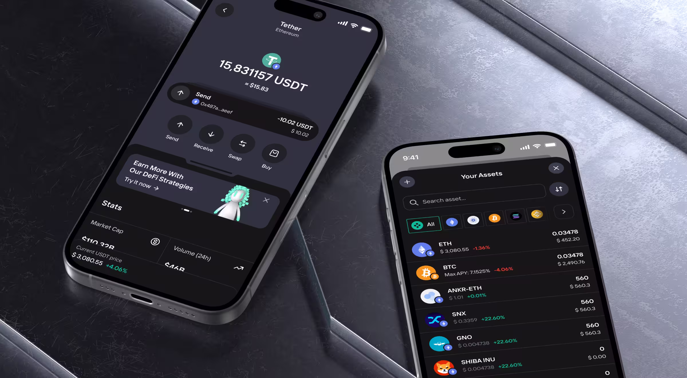
EllipX
EllipX is a European crypto-finance platform merging exchange, wallet, and fiat payment operations. They'd just completed the redesign, and it failed.
Users struggled with onboarding. Verification flows confused. Navigation wasted space. Transaction processes hid fees until the final step. Drop-offs everywhere. Incomplete verifications. Abandoned deposits.
Bad UI in crypto costs users money through mistakes, and they leave permanently.
What we did:
- Rebuilt dashboard as a modular widget system. Key actions prominent. Information density serves power users without overwhelming beginners.
- Redesigned transaction flows with complete transparency. Every step shows limits, fees, and confirmations in real time.
- Consolidated navigation from scattered side and top bars into a single top navigation.
- Enhanced asset management giving users a centralized view of holdings with real-time value updates.
"Crypto UI needs acknowledging users fear losing money permanently. Every transaction confirmation, every fee display, every status update reduces anxiety. Confident users transact more frequently."
{{Danylo Dubrovsky}}
🔎 In Web3, design is the bridge between complex protocols and real users. Explore how blockchain design can make your products usable and help you stand out from the crowd.
Dollet Wallet
Crypto wallet market split between playful interfaces scaring professionals and complex platforms intimidating newcomers. Dollet Wallet needed serving both without compromising either.
We needed to convey security and reliability while remaining accessible. One wrong interface choice destroys trust in apps managing real money.
What we did:
- Built a robust design system ensuring consistency across interfaces. Data-heavy finance applications require a systematic approach preventing visual chaos.
- Created clean, professional UI with subtle friendliness.
- Developed a comprehensive pattern library before designing screens to provide a consistency across wallet functions that builds user confidence.
Pro tip: Build a design system and pattern library first using tools like Figma, Design Tokens, and Storybook. When every balance card, transaction list, and confirmation flow follows the same logic, users build trust faster and trust is the real currency in wallet UX.
🔎 Want to see how we crafted the mobile experience for Dollet Wallet? Check Dribbble.
Fintech: UI directly impacts transaction volume
Users come to a fintech website with a clear task and money on the line.
If the interface adds confusion or friction, users will feel anxious, unsupported, and more likely to abandon the product entirely. A mistaken tap can mean transferring $5,000 to the wrong account.
Quantillium
Quantillium offers real-time access to global stock exchange filings via a unified API. Their backend was strong, but the frontend was unclear.
Developers and data teams couldn't quickly understand product depth. Poor UX hid powerful functionality. Adoption suffered despite superior technology.
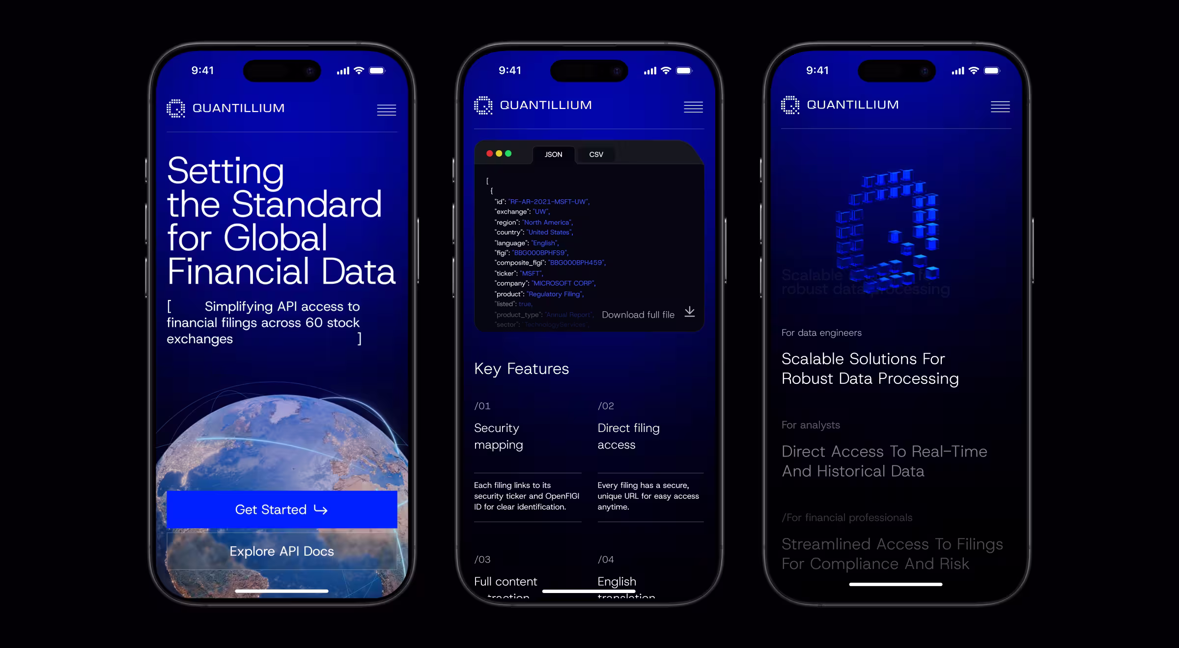
What we did:
- A complete redesign to turn raw financial data into product descriptions. Developers, analysts, and decision-makers each got messaging built for how they think.
- The information architecture was rebuilt from scratch around real developer workflows. The new structure follows the questions users genuinely ask and delivers answers without friction.
- 3D visuals and motion design gave technical complexity a voice. Floating document animations and JSON transformation sequences make abstract infrastructure tangible.
- Seamless mobile and tablet adaptation ensures the same clarity, trust, and visual sophistication, whether users explore from a desktop or on the go.
The result: 30% increase in data accessibility across key product areas. 32% increase in session duration driven by improved product engagement.
If your product feels outdated or users keep dropping off, it might be time for a serious redesign. See top redesign teams that can help you with this task.
LegalTech: simplifying complexity through thoughtful UI
Lawyers are paid to spot risk. Your interface is either reassuring them or confirming their worst fears.
So, every unclear workflow, every ambiguous confirmation, every screen failing to signal security and competence pushes a potential customer back to pen and paper.
According to the ILTA Technology Survey, user resistance remains the top barrier to legal tech adoption, unchanged year over year. In a profession charging by the hour and operating on precedent, an interface lacking immediate signals of reliability becomes disqualifying.
Encyro
Secure communication and document management platforms, like Encyro, typically sacrifice usability for security.
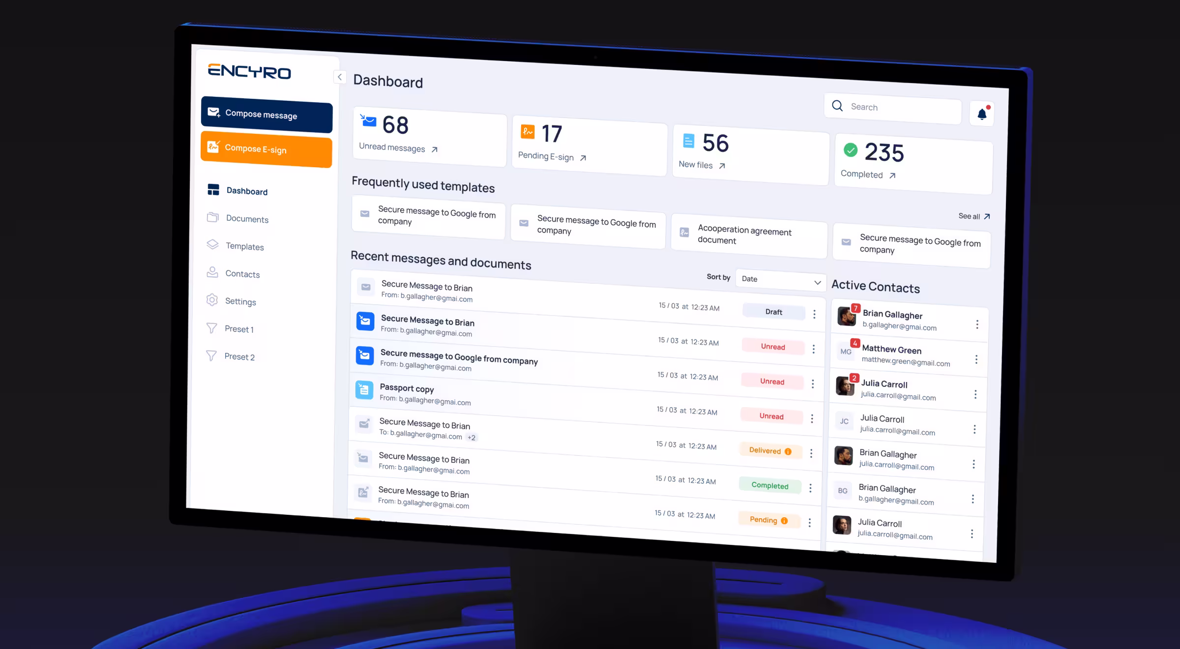
What we did:
- Designed dashboard prioritizing ease of use with a clean layout and intuitive navigation. Security features integrated seamlessly instead of feeling bolted on.
- Built-in secure messaging, e-signature, document handling streamline sensitive communication without compromising privacy.
The result: 50% faster document handling.
“Security doesn’t have to slow users down. Design interfaces where privacy is built in and test flows with real users: fast, intuitive workflows drive adoption even in highly secure platforms.”
{{Danylo Dubrovsky}}
🔎 Check out Dribbble to see how we designed the document analytics dashboard B2B SaaS interface for Encyro.
Dragon GC
Most law firm websites look credible, but convert poorly. And Dragon GC, an AI-integrated platform for lawyers, knew that all too well. So, they wanted an efficient and trustworthy solution for lawyers, so a balance is required.

What we did:
- Foundation first. A complete brand overhaul closed the gap between DragonGC's real capabilities and how the market perceived them.
- The website was rebuilt around real-world use cases. Reflecting the daily pressures legal teams face, a Report Preview feature lets visitors explore platform analytics before committing, turning passive interest into active conversion.
- Human connection was woven directly into DragonGC's credibility through a redesigned "About" section, putting named experts and their stories front and center, because enterprise buyers choose partners.
- A complete brand book and design system gives DragonGC the structural backbone to stay consistent, recognizable, and market-ready as it scales confidently into new territories.
🔎 Stop letting your AI sit unused. See how to power your design with AI.
What good UI design delivers for your business
A well-designed UI can increase conversion rates by up to 200%, and a better UX can push that to 400%.
UI design best practices worth implementing
From our work across fintech, legaltech, web3, and other industries, we found that these UI design principles can ensure the success of your project:
- Design for context. Mobile crypto traders need a different UI than desktop financial analysts. Same data, different presentation. Optimize for actual usage scenarios.
- Build trust through transparency. Show users how systems work. Explain AI decisions. Display fees upfront. Cite data sources. Trust drives adoption.
- Create consistent design systems. Document patterns before designing screens. Consistency reduces cognitive load. Users learn the interface once, then apply knowledge everywhere.
- Balance aesthetics with functionality. Visual appeal attracts and intuitive functionality retains.
- Test with real users doing real tasks Watch people attempt workflows. Don't ask if they like design. Observe where they fail.
- Optimize for primary actions. Identify what users do most frequently. Make those actions easiest.
Building products where UI quality determines market success?
You've spent months building the product and weeks on the pitch deck.
How much time have you spent on the moment a user decides whether to trust you?
Because the moment is coming. It appears when customers land on your platform for the first time, when choosing between you and a competitor they already know.
In that instant, your UI does all the talking. Only the interface and the split-second judgment it triggers, before a single word gets read.
We’ve shipped interfaces for platforms where such moments decide everything. We know how success looks and what breaks it.
Talk to us, and we’ll build a version that wins.


.webp)


.avif)